Our Best Logo Ever! Tournament takes to the ice as we take a look at our first hockey team so far, the Pittsburgh Penguins. The Penguins have won five Stanley Cups in their fifty-plus seasons, including two separate Back-to-Back titles in 1991 & ’92 and again in 2016 & ’17.
Special thanks to everyone who has participated in our past polls, the results of our Los Angeles Rams poll have been announced, check those out here. If you missed it, earlier we all decided on the best Washington Bullets/Wizards logo of all-time, as well as the best Baltimore Orioles logo ever. We’re up to somewhere around 15,000 votes cast in the tournament thus far!
As always, we begin today’s vote with a little history lesson about the Pittsburgh Penguins before getting to the poll, which is located down at the bottom of this post.
How did the Pittsburgh Penguins get their Team?
Pittsburgh was home to a National Hockey League team several decades before the Penguins started play in 1967. The Pittsburgh Pirates (yes, the same name as the baseball team) spent five seasons playing in the NHL from 1925-1930 before they moved across the state for a one-and-done season as the Philadelphia Quakers.

Forty-six years later, the NHL was in the midst of mass expansion, doubling the league from six to twelve teams in time for the 1967-68 season. Hoping to bring the NHL back to town, a group of local investors, led by Pennsylvania state senator Jack McGregor, teamed up and made their pitch to the NHL. The group’s bid was accepted, and for a fee of $2 million a franchise was officially granted by the league on February 9, 1966. Pittsburgh would join Los Angeles, Minneapolis-St. Paul, Philadelphia, San Francisco-Oakland, and St. Louis as six expansion cities for the following fall.
“[Getting this team was] a tribute to the people of Pittsburgh, who have been great hockey fans for years, and to those who were instrumental in construction of the Civic Arena”, Senator McGregor said at the time.
Why are the Pittsburgh Penguins called the Penguins?
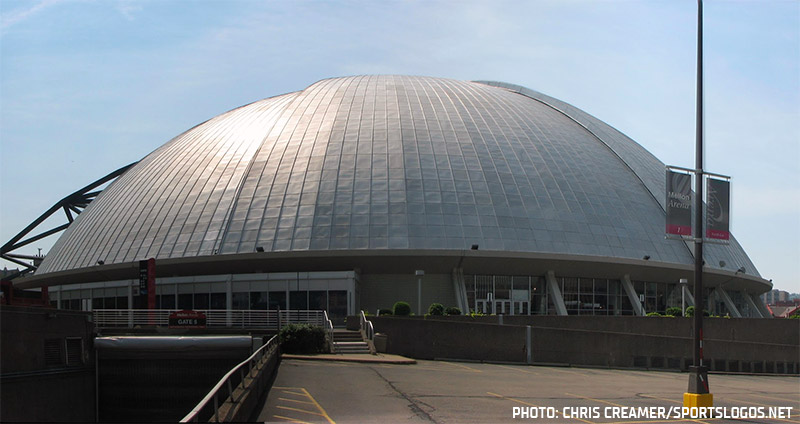
Fans wanted them to be called the Hornets, after the local American Hockey League team of the same name, but the name was still in use by the AHL team. In the first few days of 1967, before the team announced any name, journalists in nearby markets just began referring to the new club as the “Pittsburgh Penguins”, in reference to the igloo-like shape of the Pittsburgh Civic Arena’s dome.
On February 9, 1967, the team made the name Penguins official following a name-the-team contest. There were 356 different names suggested from over 26,000 entries. In the end, 716 submitted the winning “Penguins” name. Other popular suggestions included Hornets, Pioneers, Pipers, and Golden Triangles.
When asked why they chose Penguins as the name, club treasurer Pete Block told the Post-Gazette “It seemed natural, the penguin lives on the ice; hockey players make their living on ice, and there is the nickname of ‘Big Igloo’ which has become a part of the Civic Arena.”
Pittsburgh Penguins Logo History
The Pittsburgh Penguins have had several different logos over the years, but one thing has been consistent across every single design. The golden triangle, a reference to the nickname of the Pittsburgh area. The shade of gold on that triangle may have changed over the years, as has the appearance of the penguin, but no matter what year you’re tuning into Penguins hockey, that team’s got a gold triangle somewhere in its logo.
For their expansion season in 1967-68, the Penguins introduced us to the skating, stick-holding penguin we’d all come to love over the next half-century. The first iteration included a scarf tied around its neck and was placed inside a roundel with the team’s name written around it in blue. This logo lasted just one season.
In year two, the scarf was removed (they figured out how to get the heating system to work in the “Igloo”, I guess) and the penguin itself got a bit of a new look. The golden triangle remained, of course, but the circle surrounding the logo was updated.
After a few seasons, the penguin finally broke out of that circle, bringing us the logo that won two Stanley Cups and gave the NHL the likes of Mario Lemieux and Jaromir Jagr. Up until January 1980, the Penguins wore blue as their primary colour (despite the logo being black and gold), after the Pirates won the ’79 World Series and the Steelers won the Super Bowl in January ’80, the Penguins switched to black and gold mid-season to support their city-mates. The Bruins protested, saying they were the only black and gold team allowed in the NHL, but the Penguins successfully argued against this, pointing to the original NHL Pirates who wore black and gold several years before even the Bruins did.
Immediately coming off of back-to-back cups, the Penguins ditched their classic logo in 1992 in favour of what’s commonly referred to now as the “Robo-Penguin”. A modernized profile of a penguin placed on a golden triangle with several horizontal lines to show motion.
The shade of gold was lightened slightly in 1999.
As is typically the case (and you’ll see it a lot during this tournament), fans eventually grew tired of the radical re-design and demanded a switch back to the past. And as is usually the response from the team, they met the fans halfway. In 2002 the skating penguin returned but now on a “Vegas Gold” triangle.
In 2006, the gold was lightened considerably, which apparently helped the team win a couple of Stanley Cups!
Finally, the fans pushed hard enough, and following the 2016 Stanley Cup win, the original “Pittsburgh Gold” returned for 2017… and then they won the cup again!
Now that you know the entire history of the Penguins’ identity, it’s time for you to pick what the greatest primary logo they ever used. As the Penguins are a team that recycled the same basic look over and over again, I’ll again be allowing voters to choose up to two logos as the best ever. I am also combining the two minor colour tweaks into single options, so the two “RoboPenguins” will be one as will the two “Vegas Gold” penguins.
UPDATE July 17, 2020 3pm ET
The polls are closed and results are in! Check out which logo came out on top in the video below!
Thanks again for taking the time to read this and to vote, later this week we’ll be taking this tournament back to Major League Baseball. So be sure to check that out.
And of course, don’t forget to look back at our other past winning logos so far for the Baltimore Orioles, Los Angeles Rams, and Washington Wizards.
Related stories:
 2023 Winter Classic Logos, Uniforms and More for Bruins and Penguins
  Pittsburgh Penguins to Wear Highmark Ad on Jersey in 2022-23
  Penguins Bring Back 90s Look for New Third Uniform
  Penguins Make Retro Gold Official, Unveil New Uniforms
  Pittsburgh Penguins Unveil Retro Third Jersey
  Pittsburgh Penguins Unveil Stadium Series Uniform
  NHL Unveils Chrome Team Logos for Stadium Series
  The 7 Best-Dressed Stanley Cup Finals of the Past 25 Years