Our best logo ever tournament continues today with the National Basketball Association’s Baltimore/Capital/Washington Bullets/Wizards, sixty years, three cities, two nicknames, and a whole bunch of little logo and colour tweaks.
Thanks to everyone who participated in our Baltimore Orioles poll earlier this week, you can see the results of that one right here. Over six thousand votes were cast! You guys are awesome.
As was the case with the Orioles, we’ll start here with a little history lesson on the team before getting to the poll, which is down near the bottom of this post.
How did the Wizards Get Their Team?
The Washington Wizards began their time in the Capital region as the Baltimore Bullets when the Chicago Zephyrs relocated to Baltimore on March 25, 1963. It was a return of NBA basketball to the city of Baltimore which had been home to the (original) Baltimore Bullets just nine years earlier.

“I feel very delighted about our choice [of moving to Baltimore]”, said Zephyrs owner David Trager. “We received better offers from other cities, but Baltimore simply has a better climate for pro basketball. The city has been exposed to it, the people know it, they have a sports point of view.”
Ten years later, in 1973, the Bullets moved to a new arena on the outskirts of Washington, D.C. and altered their name accordingly, first to the Capital Bullets and then one year later to the Washington Bullets. In 1997 the team was renamed Washington Wizards.
Why are the Washington Wizards called the Wizards?
The Wizards announced their new name on February 22, 1996, more than a year-and-a-half before they’d play their first game with the new name in the fall of 1997. The change from Washington Bullets came following an anti-violence campaign.
“I realized some time ago we should consider changing our name,” team owner Abe Pollin said. “I picked up a newspaper and saw the word ‘bullets’ in the headline and thought the article was about my team.” Later saying, “The priority for us was to make a statement about anti-violence, to make a statement that bullets kill people. Therefore we felt the name Bullet was no longer appropriate.”

“Wizards” was chosen following a fan poll held by the team with the eventual winning option besting other options such as the Dragons, Express, Sea Dogs, and Stallions. The change wasn’t without its legal issues, a trademark infringement lawsuit was launched by the Harlem Wizards, a New Jersey-based comedy basketball troupe. A federal judge rejected their lawsuit on January 10, 1997.
Going back to the Bullets, their name can be traced back to the original Baltimore Bullets, so named on October 31, 1944. The original Bullets began life in the American Basketball League during the 1944-45 season. They moved over to the Basketball Association of America in 1947 which then became the NBA in 1949 and the team finally folded following the 1953-54 season. When the Chicago Zephyrs moved to Baltimore, they were briefly referred to as the Baltimore Zephyrs by the press, but they quickly cleared things up and announced they’d be bringing back the old Bullets name on June 4, 1963.
Washington Wizards Logo History
Here we’ll take a look at each of the Baltimore Bullets/Washington Wizards primary logos throughout their history (or you can watch the quick Bullets/Wizards logo history video above, which also includes the two Chicago team logos!). Following the logo history presented below, you’ll see a poll where you can vote on the best primary logo in Bullets/Wizards team history.
The original Baltimore Bullets logo featured a bullet flying through a basketball below the team name, it was used from 1963-64 until 1967-68.
For the 1968-69 season the Bullets switched to a horizontal wordmark showing two hands going after a basketball formed from the l’s in Bullets. Little could they have known at the time that this style of logo would follow the team through three name changes and a whole host of colour tweaks over the course nearly 30 years.
The logo got cleaned up a bit in 1987 with the five separate fingers from each hand simplified and the city name removed (things would’ve been so much easier had they removed the city name from it in 1968)
With the name change came a new logo, introduced on May 15, 1997 the Washington Wizards were officially born with a new light blue and bronze/copper colour scheme (matching the NHL’s Washington Capitals). The logo now featuring a long-bearded wizard balancing a basketball, the beard also forming the letter “W”, on a crescent moon with basketball seams.
Ten years later the Wizards simply lightened the shade of bronze/copper used in the logo…
As was usually the case with most of the radical 1990s rebrands, eventually fans wanted things to return to the old days. In the case of the Wizards, the old days were the old red, white, and blue, and the club went back to those colours in 2011. Again the colour changed matched the NHL’s Capitals who also switched their colours back to the patriotic palette a few years earlier.

In a surprising move, the Wizards announced a logo change on the eve of the 2015 NBA Playoffs, the change was effective immediately making it one of the only in-season logo changes in major North American league in recent history. The new logo kept the retro colours and ditched the wizard, the focus was now on the Washington Monument placed in a roundel below a star, a “W” is also formed above the star.
Now that you’ve seen the logos, it’s time to pick your favourite! Again, like the last poll, we’re allowing you to choose your top two Bullets/Wizards logos. If you genuinely think only one of these logos deserves the title of the greatest Washington Wizards logo ever, please just choose one! You’ll also see I combined the several different five-fingered logo variations into one for the purposes of the poll, as well as the slight colour change in 2007.
UPDATE (Jul 10/20 – 2:45pm ET)
The results are in! After nearly 4000 votes you have decided the best logo in the history of the Washington Wizards/Bullets franchise. Check out the video below for the complete results:
Our next poll decides the best logo in the history of the NFL’s Los Angeles Rams. Be sure to cast your vote now!
Of course, be sure to also check out our Baltimore/Washington Bullets and Washington Wizards complete logo and uniform histories right here at SportsLogos.Net.
Related stories:
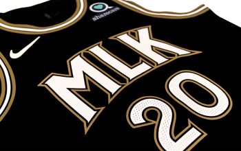
 Washington Wizards Throw it Back to 1997 with New “Classic Edition” Uniform
  Wizards Rep the District, Unveil New Uniform & Ad Patch
  Jazz, Kings, and Pistons may have new primary logos for 2016-17 season
  Wizards to Wear Updated 1970s Bullets Throwbacks Saturday
  Washington Wizards unveil Baltimore Bullets-esque Pride uniforms
  Massive Leak Shows Images of 54 New NBA Uniforms for 2015-16
  Wizards: New Logo “Effective Immediately”
  NBA: Heat, Mavs, Kings Unveil New Uniforms