The city of Brampton, Ontario had both their new CeHL and their new NBL-C team unveil their inaugural team logos over the weekend. Yes, it’ll be an interesting fall for sports fans in Brampton as they quickly go from being excited about their two new clubs to reading a footnote in the paper about them ceasing to exist within a few short months of those ceremonial first faceoffs and tipoffs… Sports!
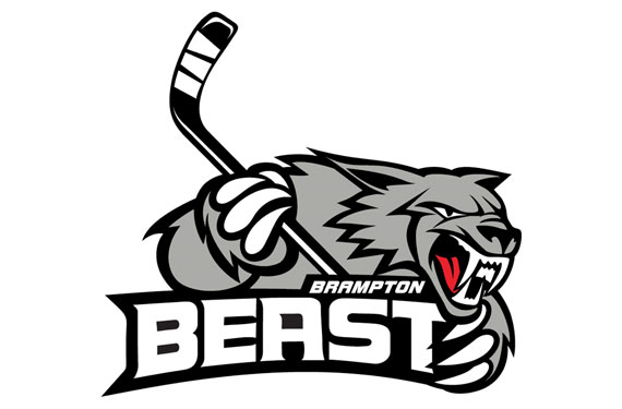
First up, it’s the “Brampton Beast“, Canada’s first entry in the Double-A (or Single-A, depends on who you ask) Central Hockey League, brought into town after the OHL’s Brampton Battalion retreated up to North Bay earlier this month.
The logo is in black, silver, and white – perhaps the latest “hot” colours in sports thanks to those pesky Brooklyn Nets. The logo was designed by Indonesian artist Andreans Endhi (some examples of his other work here). And, how surprisingly refreshing, the logo lacks the customary token maple leaf slapped on to remind everyone what country the team is from (although as the first Canadian team in this league it wouldn’t be that objectionable for it to be in there)… Wait, what’s that? “A red maple leaf will be on the uniform shoulder”? says team owner Gregg Rosen. I’m sure that’ll fit right into that colour scheme… sigh.
At the time of this posting, the Beast’s logo had a fan rating of 6.2 out of 10 on SportsLogos.Net – be sure to give it a rating yourself here.
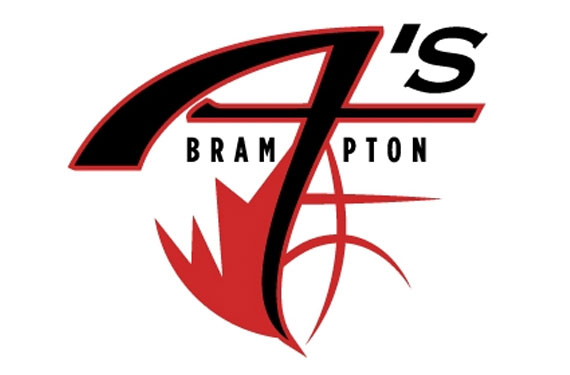
Moving onto the hardcourt and the National Basketball League of Canada, it’s the Brampton Eh’s!… sorry… Brampton A’s, who also unveiled their inaugural season logo and… yeah, it’s clearly not of the same level of quality as the Beast’s design.
There’s three different fonts (“BRAM_PTON”, “A”, and “‘s”), some sort of half-maple leaf (really, in an all-Canadian league!)/half-basketball thing going on at the bottom, not to mention the head-scratcher of a design for the “A’s” bit of the logo… honestly if I didn’t already know the name of the team I’d have thought they were the Brampton 4’s, Brampton 7’s, or Brampton T’s (With Mr. T as a mascot, now we’re talking).
The A’s become the first team in the NBL-C to use a maple leaf in their primary branding, they also become one of the few teams to NOT use a lightning bolt, so kudos for that. You can check out all the other NBL-C team logos here.


