Alas, poor Newfoundland Growlers, we hardly knew ye.
The five-year-old franchise’s ECHL membership was abruptly terminated on Tuesday, April 2, marking the end of the latest chapter of professional hockey in St. John’s, Newfoundland and Labrador. All players under ECHL contracts became free agents, with other ECHL teams able to sign a maximum of two former Growlers for the remainder of the 2023-24 season. The Growlers’ remaining six regular season games were cancelled, and playoff seeding for teams in the ECHL North Division will be determined by points percentage.
“We are saddened to lose ECHL hockey in the Newfoundland market,” ECHL commissioner Ryan Crelin said in a statement. “We’d like to thank the Growlers fans and partners for their support of the team throughout their existence, and are hopeful that hockey can return to the region for their dedicated and passionate fanbase.”
Owners Deacon Sports and Entertainment — who also owned the Iowa Heartlanders until July 2023 and sold the Trois-Rivières Lions on Tuesday — extended their “heartfelt appreciation to our fans, sponsors, partners, staff, and the hundreds of players who have proudly represented the Growlers, whose unwavering resilience and support has been instrumental to our on-ice product.”
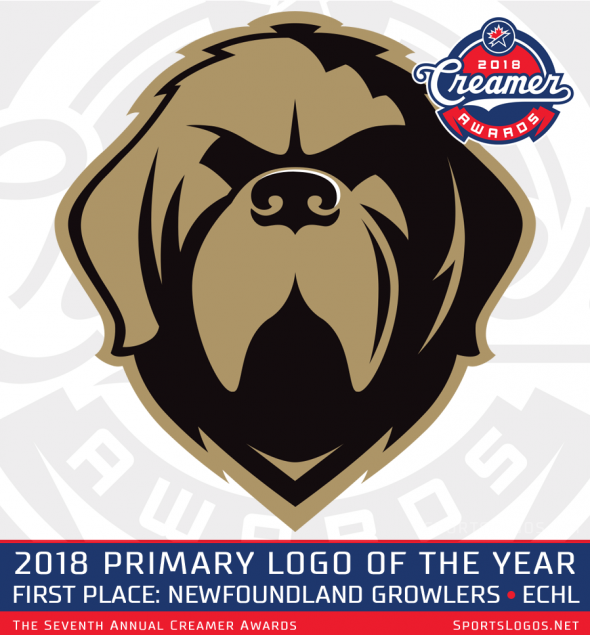
The Growlers’ name and logo were unveiled in May 2018, and they never changed over the course of the team’s short history. The logo depicted a black and gold Newfoundland dog, “a large working dog who is known for their size, strength, intelligence and loyalty,” according to the press release at the time. “The dog in the logo is fierce and stoic to represent the pride and resilience of our province, and our reputation of never backing down from a challenge.”
The colors were inspired by a locally iconic photo showing Sable Chief, a black Newfoundland dog adopted by the Royal Newfoundland Regiment as their mascot during the First World War.
The Growlers’ logo won the 2018 Creamer Award for Best New Primary Logo of the Year, beating other such contenders as Los Angeles Football Club (MLS), the Stetson Hatters (NCAA) and the Augusta GreenJackets (single-A South Atlantic League).
Like the logo, the Growlers’ jerseys also didn’t change over the course of their five seasons in the ECHL. Their dark jerseys had a black base with the Newfoundland dog logo on the front and “NEWFOUNDLAND” arched overtop in white, along with white and gold striping on the sleeves and waist.
Their white jerseys again featured the dog logo on the front with black and gold striping on the arms and waist and a gold phantom yoke around the shoulders. When they were initially unveiled, the white jerseys initially didn’t have “NEWFOUNDLAND” arched over the dog logo, but that appears to have been added in black at some point during their inaugural 2018-19 season — a season in which they also won the Kelly Cup championship.

ECHL teams wear white jerseys at home and dark jerseys on the road until the All-Star Game break in January, at which point they switch to dark at home at white on the road. During the playoffs, they switch back to white at home and dark on the road.
In 2021, the Growlers introduced a new “Regiment Gold” third jersey, which fit in nicely with their other uniforms. Like their regular jerseys, it had horizontal striping on the waist and arms, this time in white and black on the gold base. Black piping ran around the shoulders.

It’s unclear when the Growlers stopped wearing the gold alternate jersey, but by January 2023 they had released a new black alternate that leaned more heavily into the military side of the team’s identity. The jersey was black and gold — with no white to be found — and had a new logo on the front of a silhouette of Sable Chief jumping in front of a roundel with “NEWFOUNDLAND GROWLERS” spelled out inside. Two gold stripes ran around each sleeve while military-style gold chevrons adorned the sides. Chevrons also appeared on the shoulders, with the motto “STAND ON GUARD” written inside. The unofficial motto of the Royal Newfoundland Regiment — “BETTER THAN THE BEST” — was printed inside the collar.

Even with their new identity, the Growlers sometimes reached into Newfoundland’s hockey history. In 2019, they paid tribute to the St. John’s Maple Leafs — the former AHL affiliate of the Toronto Maple Leafs, the same NHL club the Growlers were affiliated with — by wearing the same uniforms they wore in the 1990s, albeit with a different name and number font.

Other special edition jerseys the team wore over the years have celebrated their mascot, Buddy the Puffin, and India Beer, a traditional Newfoundland beer brand still being brewed today. They also celebrated St. Patrick’s Day by taking the Leafs’ St. Pats jerseys and putting their own twist on them, replacing “St. Pats” with “St. John’s” on the front.

For the 2023-24 season, the Growlers had released a fifth anniversary logo and were wearing it as a shoulder patch on both their dark and white uniforms. It featured their dog head logo in front of a white V (the Roman numeral for 5) with a gold outline. This was contained in a black circle, again outlined in gold, with commemorative writing inside.

Related stories:
 ECHL’s Rapid City Rush Mark 80th Anniversary of D-Day With Military Night Jerseys
  ECHL’s Atlanta Gladiators Pay Homage to City’s Former NHL Franchise on ‘Thrashers Night’
  ECHL’s Orlando Solar Bears Go All Out for White Out Night
  Turtle Power: ECHL’s Florida Everblades to Suit Up as ‘Las Tortugas’ For Hispanic Heritage Night
  The Kids Are Alright: ECHL’s Adirondack Thunder Unveil Jerseys for Kid’s Day Game
  ECHL’s Cincinnati Cyclones Call Up Throwback Jerseys for Teddy Bear Toss Night
  ECHL’s Newest Franchise, Tahoe Knight Monsters, Rises From the Depths
  Savannah Ghost Pirates Unveil Jerseys for 2024 ECHL All-Star Classic