

Major League Soccer’s second Los Angeles team officially has an identity now, and they’ve gone with a bit of a glamour look here with a stylish color combo of black-and-gold, and a simple “LA” logo with a winged “A.”
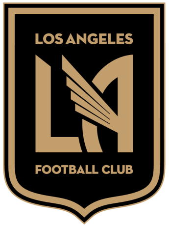
Obviously, the first thing that catches your eye here is the wing. What’s up with that? Fortunately, the club has come up with one of those explanations that you normally get whenever teams unveil a design element that doesn’t have obvious reasoning from the start.
The wing represents power, strength, and speed and is universally recognized across cultures.
The Roman deity Mercury, and his Greek counterpart Hermes, each with wings on their sandals and cap, are known to represent swiftness and success. In parts of the Middle East, a winged disc or feather-robed archer, is thought to represent a Fravashi, or guardian angel. The Feng-Huang, a Chinese mythological bird, is seen as a symbol of power, prosperity, grace, and virtue.
For the Aztecs, a winged eagle was a symbol of the sun and a representation of the victorious god Huitzilopochtli, god of war, sun and the patron of what today is Mexico City. The eagle symbolized power and bravery in Aztec culture, with eagle warriors, or cuāuhmeh, known to be the most feared. To this day, the eagle is the centerpiece of the Mexican coat of arms.
The winged eagle landed in Los Angeles in 1974, as the crest of the North American Soccer League’s Los Angeles Aztecs.
With the wing in our crest, we seek to unite our team and our fans under a recognizable and relatable symbol, with ties to the diverse culture of Los Angeles.
Personally, the only thing I’m buying here is that the wing was actually a nod to the old NASL Los Angeles Aztecs, and it’s a pretty decent tribute if that’s the case. If they couldn’t or didn’t want to take on the identity of the Aztecs, then this was a nice way to pay tribute to the soccer heritage in the city of LA.
Here’s further explanation from the designer himself, Matthew Wolff.

Meanwhile, the team also has a few secondary logos. There’s a secondary logo that has the winged LA logo in a shield by itself, a LAFC wordmark logo, and then you have the winged LA logo by itself and the full wordmark which you can see below. Also, the team will have a bright shade of red as a tertiary color, which means that at least one element from the team’s placeholder logo will be carried over to the team’s permanent identity.

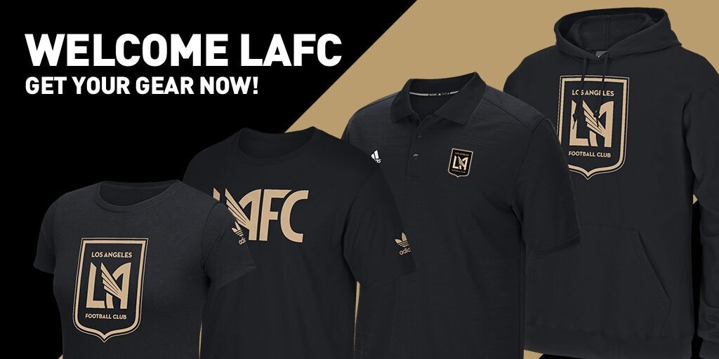
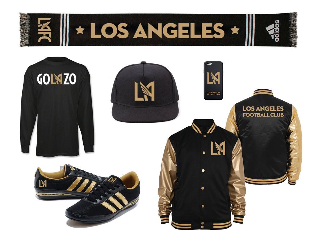
I will say this: The team’s gear is incredibly stylish. If you’re going to try to make headway in a city like Los Angeles that already has Major League Soccer’s model franchise in the LA Galaxy, then you’ve at least gotta make sure that your team gear looks cooler than your local rivals. That appears to be the case here, as some of this gear is definitely worth sporting as just casual wear. Also, as everyone’s favorite Canadian rapper will attest to, black-and-gold is currently “in,” so LAFC are already starting off on the right foot in that regard.
Overall, the crest isn’t the most attractive thing in the world, but it seems like a solid start to what could be a pretty good identity. MLS has done a solid job when it comes to both rebrands and new crests, and this is no exception. This crest will fit right in with the rest of the league, in my opinion. Do you agree?
Related stories:
 MLS Renews Calls to End Plastic Waste With Return of Parley Kits
  2023 Football Kit Preview: Major League Soccer
  Adidas, Major League Soccer Extend Contract Until 2030
  Photos of Leaked New Kits for 4 MLS Clubs Pop Up Online
  Friday Flurry of Activity Across MLS Sees 11 Teams Unveil Kits Ahead of 2022 Season
  Leaked Photos Show New LAFC Home Kit Featuring Art Deco Pattern
  LAFC Strikes Gold With New Secondary Kit
  MLS: Terrible Ad Destroys Otherwise Swell LAFC Kit