The Madison Mallards, a Wisconsin-based collegiate summer team in the Northwoods League, unveiled a new identity this weekend that plays on connections to the local community. The suite of logos, designed by Planet Propaganda, a creative agency based in Madison, are headlined by mascot Maynard G. Mallard calling his shot Babe Ruth-style while standing at a home plate made of cheese.

“Bright and bold,” the team said, “this homer-hitting duck is pointing straight to the Northside of our beautiful isthmus,” referring to Madison’s place on the narrow piece of land between Lake Mendota and Lake Monona. (That isthmus also appears to be represented on the strip of land between the two bodies of water that Maynard is standing in.)

The color palette includes versions of the team’s traditional green and yellow, will the addition of blue and cream.

A tertiary mark further accentuates the connection to the local community with a border made of sausage links, playing on Wisconsinites affinity for encased meat.

The team describes its new typographic branding like this: “The sashaying ‘M’ and Mallards wordmark evoke the nostalgia of America’s favorite pastime and fun summer days at the ballpark.”

The new look for the Mallards is the third brand for the team since its inception in 2001, including the team’s original look, from 2001 to 2010, and its most recent, from 2011 until yesterday morning. The Mallards will take the field with their new brand for the first time May 31.
Related stories:
 Dishing it Out: Here Come the Minot Hot Tots
  Wisconsin Woodchucks update logos, rebrand as Wausau Woodchucks
  Rochester Honkers update logos, add purple
  Introducing the Battle Creek Battle Jacks: Part of this complete breakfast!
  La Crosse Loggers launch latest logos, Louie
 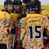 Ballclub Thinks Similar Emoji Hockey Jerseys are Frowny Face, Chocolate Swirl
  Baseball Team to Wear “Selfie” Jersey