![]()
For the first time in over 45 years, the Toronto Maple Leafs will be getting an entirely new logo.
Confirmed to SportsLogos.Net by several reliable sources, the Maple Leafs are expected to unveil both a new logo and entirely new uniforms in time for the 2016-17 season which will be their 100th as a franchise in the National Hockey League.
It’s all just part of the Leafs’ plans to go all out in celebrating their centennial season; a series of throwback jerseys is also in the cards which would, at the very least, include a re-appearance by the green Toronto St. Patricks uniform from the 1920s.
After evolving their logo steadily throughout the 43 years following their adoption of the “Maple Leafs” name in 1927, the team has made only very minor changes to their logo in the 45 years since. Introduced in 1970, the current Leafs logo sharpened its corners and plumped up a bit in 1982, then darkened its blue for 1987.
![]()
Those 1970-2016 versions of the Leafs logo are the only ones (the half-season green from 1927 aside) to not appear on a Stanley Cup banner hanging above the ice at the Air Canada Centre, despite being worn for nearly half of the team’s existence. Not a lot of happy memories with the current look.
Right now the only hint we have of what the new logo will look like isn’t too much of a surprise at all — “a combination of all past team eras plus a nod to the future”. This is basically the same mould used by all past logo changes implemented by the club. So, just another step in the evolution? Makes sense.
Throughout the current season the Leafs have been using a variation of their logo without the familiar text on the leaf on graphics across their social media channels, examples below:
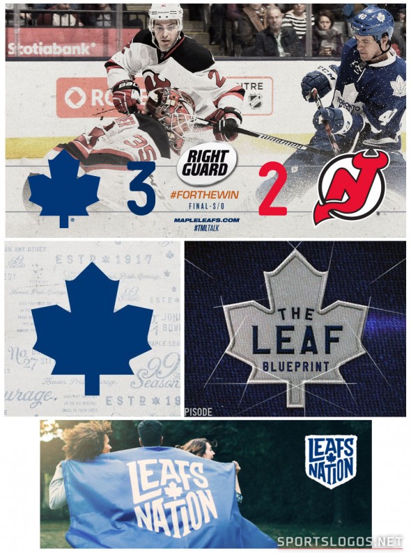
This isn’t something the club has really done in recent years… it was seen previously on the shoulder of their uniform worn between 1970 and 1992, at centre ice of the old Maple Leaf Gardens, and it’s also currently on their AHL farm team (which the club owns), the Toronto Marlies and their awesome alternate throwback-style uniforms.
Could this possibly be a toe-dip to soften the blow of a new wordmark-free Leafs logo? One common request by teams designing new, modern logos is to allow for their ability to be re-produced easily at a very small scale, eliminating the wordmark would certainly do that.
Maybe the wordmark itself is what’s getting the make-over and the team is just trying to distance itself from it a little early? But you’d figure any “combine all eras + future” evolution to the logo would also include a change to the shape of the actual leaf. So the social media graphics could actually end up being nothing worth noting.
Ultimately we don’t really know at this point, but anything with a focus on the past wouldn’t be the worst move they could make… I mean, this *is* the same ownership group behind the recent re-branding of the Toronto Raptors, and we all saw how that ended up.
They wouldn’t dare mess this one up too, would they? Just, no roundel please.
We’ll let you know if we hear anything else.
Related stories:
 My Journey to (and at) the 2022 NHL Heritage Classic
  NHL Leaks! New Third Uniforms for Lightning, Leafs, Kings
  New Leafs Uniforms Coming in One Week
  Leafs, Red Wings Unveil 2014 Winter Classic Jerseys
  Red vs Blue at Winter Classic? Leafs, Wings Jerseys Spotted