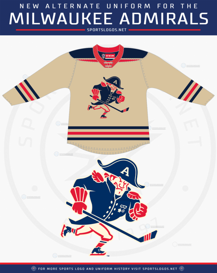
The Milwaukee Admirals dipped back into an alternate past for the design of their brand new third uniform.
Designed by Dan Simon of Studio Simon, the American Hockey League team’s new logo and uniform are a look at what the Admirals “might have looked like” had they been around in the 1950s and 1960s.
“We are really excited to add this third jersey and new fauxback logo to our current collection,” said Milwaukee Admirals Owner Harris Turer in the press release. “Once again Dan Simon has hit the jackpot with his unreal work.”

Simon, in addition to designing the current Admirals set, has also worked on a host of other identities including two Super Bowls, the Savannah Bananas, and the 2017 Creamer Award winning Memphis Redbirds set.
LINK: Milwaukee Admirals logo history on SportsLogos.Net
The logo features a retro cartoon of an admiral wearing a blue uniform with red details and an “A” on its hat, the admiral has old-school hockey gloves and skates and is shown skating while holding a hockey stick.
“The look of the logo is derived from sports and cartoon illustrations from the 50s and 60s that featured barrel chested characters,” read the release. “The skating pose was popular on drawings on the backs of hockey cards during that time.”

Established in 1970 as the Milwaukee Wings, the team quickly was re-named the Admirals after a popular brand of kitchen appliances sold by team owner Erwin Merar in his stores. The Admirals played in the USHL before joining the International Hockey League in 1977, they were absorbed into the AHL in 2001 upon the demise of the IHL.
Like this “fauxback” design, Milwaukee’s original colour scheme was red, white, and blue and the team used a logo featuring a cartoon admiral wearing a hat with a large white “A” on it.

The new alternate uniform will be worn between ten to fifteen times per season and will be worn both at home and on the road beginning with the upcoming 2021-22 AHL season.


