Forty years for that?
The New Jersey Devils made it official this morning by unveiling their previously leaked third uniform, it’s the first official alternate uniform in Devils franchise history.
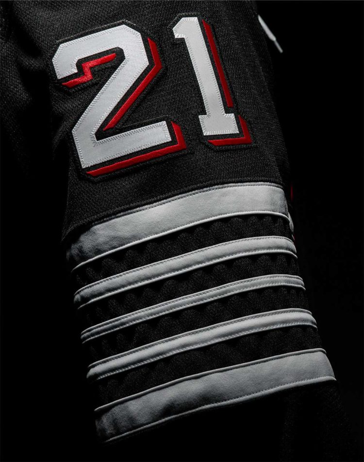
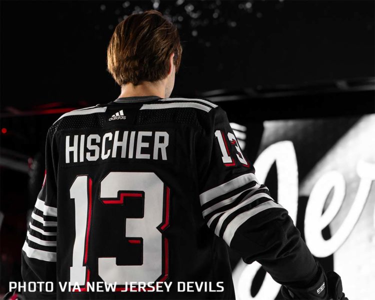
It’s black and white with the slightest hint of red, white stripes everywhere. “Jersey” is scripted across the chest with a lace-up collar, the arms and back feature white numbers with a red drop shadow.

According to ESPN, the uniform was designed primarily in partnership between the team’s Sr. VP of Marketing Jillian Frechette and Hockey Hall of Fame goaltender Martin Brodeur. As always, the NHL and Adidas were also involved along the way.
“I wish we could have played in this,” Martin Brodeur said in the ESPN article. “It’s just a cool thing.”
The jersey is similar in design to a couple of historic New Jersey hockey teams including the 1928 Newark Bulldogs who also skated while wearing sweaters with white stripes all over the shoulders and sleeves.

But, as always these days, the uniform is full of manufactured meaning. Instead of simply rolling with an appropriate “we wanted to replicate the sweater worn by historic New Jersey hockey teams”, they’re explaining away just about every stitch of this thing, providing answers to questions nobody would have otherwise asked.
Such as…
Why are there exactly 21 stripes and why are five of those stripes located specifically on the left shoulder?
An appropriate answer would be “There’s 21? We didn’t count. We simply designed it with those amount of stripes in those places because we liked it better that way”.
The Devils official answer is that there are 21 stripes because there are 21 counties in the state of New Jersey, five stripes are located on the left shoulder (above the heart, no less!) in recognition of the team’s five retired banners.

Or how about another question nobody would ever ask… “why are there laces at the collar?”
No, no, it’s not “because this is a tribute to historic sweaters and we liked the addition of a detail from uniforms of the past”
Instead it’s a tribute to Martin Brodeur because the laces kinda look like the mesh of a the net and, well, Brodeur’s role was to protect this net.

As a friend of mine said in a message to me today, it feels like a parody of a uniform unveiling with these explanations… If Weird Al is now expanding his reach beyond music, well then that’s good for Al (and frankly good for the world, we could use more Weird Al).
I mean “Jersey” on a jersey… And hey, did you know the “Jersey” script has a red shadow because the team’s primary colour is red?

Why not an explanation for why they’re wearing a uniform at all? Let’s just take this as far as it’ll go. C’mon I’ll help…
“The full uniform covers the player’s equipment in honour of how our team covers the entire state of New Jersey, stripes are on the knees of the socks because we k-need our fans in our building to cheer us on.”
Yeah, I’ve spent the entirety of this article ranting about the silliness of the team’s rollout of this… perhaps, maybe, I should take an actual look at the design?
Alright, here’s the full uniform:

They look like the Chicago Blackhawks. It’s the same colours and almost exactly the same layout of what the Blackhawks wore in the 1920s and 1930s and have brought back again a few times in recent seasons. Upon the first presentation of this concept someone in that Zoom call should’ve squashed it and steered it away for that reason alone.
The scripted crest is *o.k.* but in these cases I’ve never been a fan of a team using anything other than their actual names on their jerseys. We’ve seen it before from Ottawa’s “Sens”, Tampa Bay’s “Bolts”, and Carolina’s “Canes” designs. “New Jersey” would’ve been better if we had to do this at all, frankly I would’ve preferred the team’s almost iconic intertwined “NJ” logo (do it without the circle if you insist on having to change something).
What we wanted vs what we got pic.twitter.com/V71PnuBe5R
— DevsFan72 (@DevsFan72) November 23, 2021
Whether you love it or hate it, as it’s an official third uniform the Devils will be wearing this uniform for the next three seasons for anywhere between 12 to 15 games each season, per NHL rules. This year they’ll be worn thirteen times with the first time coming on December 8th against the Philadelphia Flyers.
Featured photo at the top of the article is via Adidas


