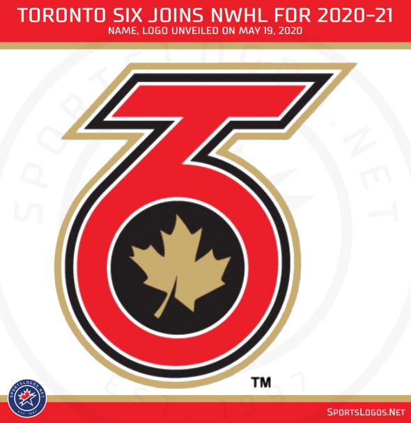
A dash of tradition with a sprinkle of modern.
That’s the best way I can describe the name of the National Women’s Hockey League’s newest team, the Toronto Six, who unveiled that name along with their logo yesterday afternoon.
The modern? Well “The Six” is a relatively new nickname for the City of Toronto. It grew in popularity during the previous decade mostly due to Drake’s usage of the name. It refers to Toronto’s two main area codes (416 and 647) as well as the six cities and boroughs that make up the city.
The traditional? There are six players typically on the ice per side throughout a game and, as anyone who has read old-timey accounts of sporting events would tell you, the number of players in play was a common, unofficial way to refer to teams during this era. Do the Mudville Nine ring a bell? I know they’re not a real team (well, at least not originally), but it’s still a good example of its use. Prefer a real-world example? How about the Ottawa Silver Seven! Won the Stanley Cup Champions a bunch of times between 1903 and 1906 who were named for the seven players on the ice at the time.
“We wanted a bold, clean and modern brand for the team, for the game and for the city,” said Tyler Tumminia, chairman of the Toronto Six in the official press release.
Other names the team considered included the Polar Bears, Tigers, Towers, Lady Leafs, St. Pats, Kraken, Lakers, Toronto HC, Frost, Monarchs, Pioneers, and Furies – the last a nod to the Toronto Furies, a former CWHL team which recently called the city home for ten seasons until the league folded last year.

As for the logo, it shows a combination of a “TO” (Toronto Ontario) as well as a 6 from the team name. Inside the “TO6” symbol is an angled golden maple leaf because Canada, of course. They’re saying the maple leaf has a hockey stick in its negative space (though I’m not sure I see it) as well as the angle of a skate edge. It was designed by New York’s M Style Marketing who had previously done the jerseys for several past NWHL All-Star Games.
Team colours are red, gold, and black.
Red because Canada.
The Gold? (well, are you ready for the longest explanation for a single colour in the history of logos?) “Gold reflects the Golden Horseshoe region in Ontario and also the high standards set by everyone in Canadian Women’s hockey and the levels of excellence the new NWHL team is committed to establishing as a perennial Isobel Cup contender as a provider of opportunity for women in sports and as a leader in the advancement of women’s professional hockey in North America”
TL;DR? Gold = good.
While some are saying the colours could be a tribute to the Toronto Raptors, the potentially forever champions of the NBA, when I looked at the logo I immediately thought of the Ottawa Senators — who are not exactly a favourite team amongst the Toronto hockey faithful.
“Launching our first team in Canada is a pivotal and proud moment for the NWHL,” said league Founder and Commissioner Dani Rylan when the team was announced last month. “Everyone in the Toronto hockey community can be sure that this first-class team of professionals will make bold strides for the women’s game.”
“Toronto is without question the sports capital of Canada,” Toronto Mayor John Tory also said last month. “The addition of a Toronto team for the National Women’s Hockey League is most welcome by our city and one that I know many Torontonians will embrace as they have with all of our other sports teams.”
The Toronto Six is set to begin play in the 2020-21 season which, under normal circumstances, would begin this October. The 2020 NWHL Championship Game (the Isobel Cup) was scheduled for March 13th between the Boston Pride and Minnesota Whitecaps and, as you likely already know with anything dated post-March 12th, was unfortunately ultimately cancelled.
The Six will unveil their new uniforms in the coming weeks.


