

While the Canadian Football League prides itself on its’ distinctions from the NFL, some things naturally follow north; after the NFL’s recent rebrand, the CFL turned to Reebok, looking to follow suit.
Much like when the kid down the block has some new duds, before long, other kids are beseeching their parents, pleading to stay cool too.
However, when the redesign is functional as much as form-related, it’s time, and the new uniforms have arrived, just in time for the centary season of the CFL.
According to Reebok and the CFL, each team has had a hand in the two-year-long design process; “We reached out to each team individually to see what they wanted to do,” said Tania Enciso, Reebok’s Sourcing Apparel Manager. “It took two years, but we’re excited about the final product.”
While the new uniforms emphasize performance, incorporating stay-dry techniques and improved elasticity, fans have shown that they clearly want a sense of team identity. Some online forums and commenters show an ambivalence towards recent CFL design changes, with the Calgary Stampeders’ jersey creating a special schism; logo and uniform afficionados, as well as the casual fan, don’t seem to be shy about expressing a preference for a return to primary team colors, and some nervousness has shown – partially in response to the NFL’s efforts, particularly the new uniforms of the Seattle Seahawks.
With yesterday’s unveiling of the East Division uniforms (Check the West Division’s unveils, up-to-the-minute as clubs pull back the curtain, right HERE), the CFL has shown a distinct preference for simpler, cleaner lines, eliminating a lot of the extraneous piping and stripes that found themselves scattered throughout previous designs.
TORONTO ARGONAUTS
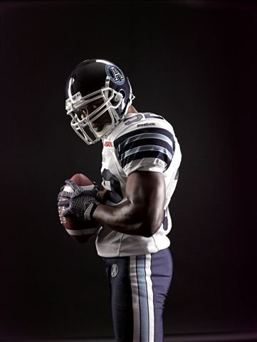
Out of all the CFL franchises, it can be argued that Toronto has the most interest in keeping a link to the past. With their roots in the Argonaut Rowing Club, the club’s colors have always been Double Blue, a fact that has forever figured prominently into the club’s marketing efforts.
The new jerseys are no exception. While some fans are already calling the new duds out for being a bit bland, others seem to enjoy to the return to traditional stripes, which evoke memories of the late 1960s and early 1970s’ winning teams.
The team has been careful to preserve links to last year, most notably with the helmet, retaining its’ capital A “Jason’s Shield” within a circle design, while moving “forward to the past” with uniforms incorporating the new technology but also Cambridge & Oxford-style stripes and a “back to basics” name and number scheme.
The players mostly preferred to extol the virtues of the ‘mechanics’ of the new jersey, with slotback Andre Durie loving the breathable nature of the fabric; “Having something that’s breathable is so much better for recovery while you’re playing.”
However, new Argonaut quarterback Ricky Ray was quick to point out that a good looking uniform was also important to players; “As athletes, we say if you look good and feel good you play good.” The quarterback also admitted, “We spend a lot of time in front of the mirror before the game before we go out, I know a lot of people don’t know that but the better you feel that way the more confident you’re going to be.”
HAMILTON TIGER-CATS

The Hamilton branch of the CFL is another highly-storied franchise; from the reincarnated Pigskin Pete to the “Box J Boys”, the Tiger-Cat jersey has figured prominently in fan lore since well before the days of Harold Ballard.
The club, like its’ hated rival from Toronto, has opted for simplicity, removing the yellow stripe from the helmet and returning to old-school sleeve striping and simpler block-font number and letter schemes.
“I love the cleanliness of it, to me it’s simple,” Hamilton quarterback Henry Burris said. “Sometimes when you dial things back and make them simple it gives it the best look possible.”
The usual pouncing Tiger-Cat will adorn both the helmet and the sleeves, making for a classic look that is still instantly identifiable, and the club nudged the uniforms back towards a pure black-and-gold scheme, changing the home uniforms’ numbers to gold and adding a gold stripe down the leg of the uniform pants.
A detailed summary of what’s changed with the Ti-Cats uniform is available here, courtesy The Hamilton Spectator
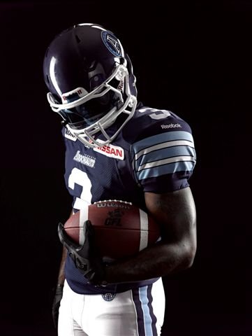
WINNIPEG BLUE BOMBERS
 For the first time in recent memory, a CFL team will not wear white on the road – and the reviews are positive.
While the number and name scheme remains largely the same, the addition of opposite-color roundels on the sleeves sets the Winnipeg uniforms off, though some posters expressed a preference for the sleeves to be all one color.
With the home uniforms remaining blue, with gold numbers, the homage to the team’s colors remains intact, dating back to the days when a Winnipeg sportswriter noted that the team was, like “Brown Bomber” Joe Louis, the city’s “Blue Bombers”, a colorful moniker that has stuck.
A simpler team logo, dropping the famed Bomber lightning bolt in favour of the block “W” of 1990s fame, is featured on each shoulder as well as the team’s helmets.
Some were more concerned with the team’s on-field performance, with one Twitter feed saying, “Nice unis. Now where’s the Cup?”
MONTREAL ALOUETTES
 La plus ca change, the more things remain the same. With the exception of a block “ALOUETTES” across the front of the home uniform, and a slight narrowing of the overbusy striping, the Montreal side evidently feels comfortable in duds that have undergone relatively little turnaround.
Some found positives in the lack of change, however.
“I love the fact that we have now have the word ALOUETTES on the front,” Montreal receiver Jamel Richardson claimed of the new look. “The name is ‘in-your-face’ and everybody in the league is going to see who is coming after them for a full 60 minutes.”
The team’s burgundy-blue-and-white scheme is also remaining unchanged, as are the predominantly silver helmets, but the technological changes were welcomed by players everywhere, defensive end John Bowman claiming to be amongst them; “The material feels really light and I really like the fact that the jerseys are more fitted when I put on my shoulder pads. My hat goes off to those guys who look to constantly improve the way we play the game of football. These technological advances are pretty cool.”
—
Check the West’s unveils, up-to-the-minute as clubs pull back the curtain, right HERE.
Related stories:
 Montreal Alouettes Launch Red Alternate Uniform Ahead of Canada Day Debut
  CFL’s Blue Bombers, Roughriders to Commemorate Orange Shirt Day With Special Pre-Game Jerseys
  Roughriders, Blue Bombers to Honour Mass Stabbing Victims with Helmet Decals
  CFL’s Montreal Alouettes Unveil New Helmet for 2022 Season
  CFL’s Hamilton Tiger-Cats Honour Angelo Mosca with Helmet Decal
  Saskatchewan Roughriders Once Again Break Out Retro Uniforms for Labour Day Classic
  CFL Unveils New Adidas Uniforms Across League
  The West’s Turn: New CFL Uniforms Take Flight