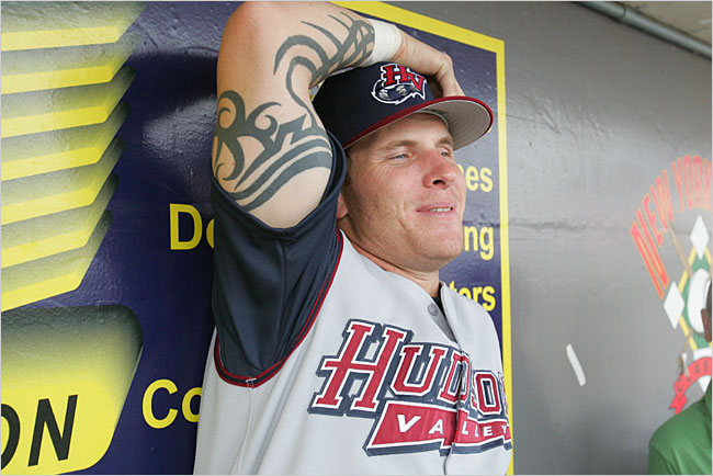
If you were to get on a boat in New York City and travel north for about 75 miles along the Hudson River, you would arrive at a tiny town of Wappingers Falls, New York. On your way there, you would pass countless historical sites related to the American Revolutionary War. The Hudson Valley played a crucial role in the British goal to divide the New England states, and as a result, lots of important battles were fought there. So important to American history is the Hudson Valley that fortifications built there during the Revolutionary War have since become the United States Military Academy at West Point—just about 25 miles from Wappingers Falls.
So in 1994, when a short-season Single-A team called the Erie Sailors moved from Pennsylvania to Wappingers Falls, they adopted the name Renegades, which reflects the spirit of those plucky Revolutionary Americans, who, in the words of President Thomas Whitmore, declared in one voice, “We will not go quietly into the night! We will not vanish without a fight!”

“We’re in the hotbed of the Revolutionary War, West Point, a lot of battles were fought here, and Washington’s encampment is in this area,” said the team’s vice president Rick Zolzer, who has been with the team since its inception. “There are so many things that we thought the name Renegades linked back to, that it just seemed like a natural.”
 Of course, as with any team name, there were dissenters when the team was announced, but given that this was 1994, before the onslaught of wacky nicknames we see now, it wasn’t too bad.
“You’re never going to please everybody,” Zolzer said. “It’s just impossible. There’s always going to be somebody who wanted them to be called the Hudson River Sea Monsters.” (Hudson River Sea Monsters would have been cool, but if I had been around, I would have advocated for the name Wappingers Falls Honkers, an homage to the area’s onetime occupation by the Dutch, who call baseball “Honkbal.”)
“If there were naysayers,” Zolzer continued, “they shut up pretty quick, because I think after the sixth or seventh game that year, they started the sellout streak that went for like four or five years.”

All of that said, the Revolutionary inspiration for the team name has never been evident in the team’s visual identity. Instead, there have been several iterations of a raccoon-based logo. They debuted in green and burgundy, then switched to blue and red a few years later. (More on their current cyan brand below.)
“They thought that you could make a raccoon cute,” Zolzer said, “and doing an actual renegade, like a minuteman, just didn’t seem to have the same caché.”
 Raccoons do seem to fit naturally with the term renegade—they’re smart and curious and they’re not afraid to eat your garbage if they have to. Not only that, the Hudson Valley is full of them.
“It is an animal that is all over this area,” Zolzer said. “You can’t go through Hudson Valley and not see raccoons on the side of the road. They’re everywhere.”
I asked Zolzer if he gets a lot of questions about the disparity between the origins of the team name and the raccoon-based visual identity.
“I don’t think anyone’s asked me other than you in the last ten years,” he said. (That’s why I’m here, folks!)
The original Renegades logo and updated versions a few years later were created by prolific designer Dan Simon of Studio Simon. While those logos were successful (and just the right amount of adorable for a short-season Single-A team), in 2013 the Renegades took the unusual step of having amateur designers on staff create an entirely new brand.
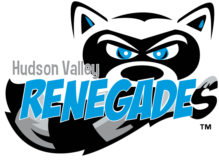
The current identity (above) was designed by Eben Yager, the team’s general manager, who is still with the team, and Corrine Adams, who was involved with the Renegades marketing at the time.
“They spent hours and hours and hours going over concepts and color schemes,” Zolzer said. “They got to it. Bunker mentality, and they got it done. I’m happy with it, and the fans are too. I think they caught lightning in a bottle, for sure.”
 There are aspects of the new logo that a professional designer would have done differently (I’m pretty sure that the word “Renegades” is set in a free font called “Super Hero”), but the result has been popular with fans. In particular, a cap logo featuring the eyes of Rascal the raccoon has been the team’s best-selling merchandise item.
Every time I research a team for this series, I learn something unexpected. The Renegades are in their 24th season, and are one of the longer-tenured teams in the New York-Penn League. Having seen their logos for years, I never would have guessed that the inspiration for their team name was the Revolutionary War. It’s yet another example of what our team’s nicknames say about what matters to us about the places we live.
French-born philosopher Jacques Barzun famously wrote, “Whoever wants to know the heart and mind of America had better learn baseball.” I might be biased, but I’d argue that if you want to know North America even better, you’d better learn the stories behind minor league baseball nicknames.
Related stories:
 More Cowbell: The Story Behind the Visalia Rawhide
  The Ocean Blue? The Story Behind the Columbus Clippers
  Got Our Eyes on You: The Story Behind the Chattanooga Lookouts
  Leading the Charge: The Story Behind the Frisco RoughRiders
  That Nashville Sound: The Story Behind the Nickname
  It’s Corny, But it’s Good: The Story Behind the Cedar Rapids Kernels
  The Story Behind the Carolina Mudcats: It’s the Fish, Stupid
  Rancho Cucamonga Quakes are the Picture of Stability