The Everglades, a sweeping, steamy wilderness in south Florida, plays host to an incredible natural diversity. The U.S. National Park there has been designated an International Biosphere Reserve, a World Heritage Site, and a Wetland of International Importance. It’s known for its mangrove forests and as a breeding ground for hundreds of species of tropical birds, and it’s also home to endangered and protected species like manatees, panthers, and crocodiles.
Being such an interesting place and valuable natural resource, it’s no surprise that it would be featured in a prominent magazine—a magazine that mysteriously showed up in the mailbox of the team’s president and co-founder, Craig Brush, a native of Milton, Ontario, back in the late 1990s.
“When we were trying to determine what the name would be, I was reading a National Geographic, which I don’t subscribe to, but somehow came in my mail,” said Brush, who was in Michigan at the time. “I was just looking through it, and there was an article in there on the Everglades.”
The team’s location in Estero, Florida, on the periphery of the protected area, would become the inspiration for their name. But the Florida Everblades, an ECHL affiliate of the Carolina Hurricanes and Tampa Bay Lightning founded in 1998, would pull from other teams, existing or defunct, to round out their identity.


“At the time, the Kentucky Thoroughblades were playing hockey in the American League,” Brush said. “So I read this, and in the back of my mind, I’ve been trying to think of what nickname we were going to use, and so I thought, Everglades … Thoroughblades … Everblades.” (The Thoroughblades played 1996–2001, and are now the Worcester Sharks.)
The team colors were also drawn from an existing team—one with one of the most revered logos in sports.
“My partner is Peter Karmanos, who owns the Carolina Hurricanes,” Brush said. “At the time they were the Hartford Whalers, and so we used the old Hartford Whaler jerseys. Those colors, which were the right colors for Florida, too, with the blue and the green.”
The team’s uniforms also draw on inspiration from successful looks already out there in the professional hockey ecosystem.
“When we’ve had third jerseys,” Brush said, “we went with the Everblades on an angle like the New York Rangers would do.”
But the defining characteristic of this logo, designed by Barnstorm Creative Group in Vancouver, is unique to the team—it’s one of those “Oh yeah!” realizations when you give it a second glance. “If you look at it, it’s a skate,” Brush said. Indeed the, the contour of the alligator reflects the shape of the boot and the silver type reflects the blade, complete with a steel runner formed by an extended stroke from the bottom of the letter S. Also, the laces on the bridge of the alligator’s snout make more sense when you realize it’s meant to be a hockey skate.
“We wanted the alligator in there, so we fiddled around with that for some time,” Brush said. “We did several different iterations of it, and came up with the idea of having the laces on the top of the boot to be in the alligator shape.”
On a side note, I think the greatest uniform novelty in the history of sports would be if the Everblades actually wore skates that looked like their logo.
 A lesser-used alternate logo features another species endemic to the Everglades, an airboat. A version with the team’s mascot riding the airboat appears as a patch on the team’s uniform.
In an ever-shifting nature of the minor league sports logo landscape, the Everblades have had a consistent look since their inception in 1998. I asked Brush if the team ever considered a change, and he said emphatically, “Not as long as I’m alive. That would be sacrilege.”
And why would they mess with it? The Everblades have had success on the ice, making the playoffs in all but one of their seasons, and in the stands. They’ve led the ECHL in attendance five times, and have never finished outside the top 10 in attendance. They’ve been so successful that they’ve have to stem the tide of their popularity in some ways.
“We’ve had to write cease and desist letters to places in Canada and other places where they’ve decided that it would be a good logo to use for their high school team or whatever,” Brush said.
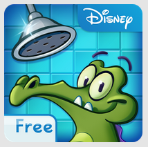
One of the areas where the Everblades’ success has met with flattery in its sincerest form is with their popular mascot, Swampee. Brush couldn’t help but notice a certain familiarity in a character from none other than the Walt Disney Company.
“They have a Swampy that’s in one of their apps,” he said, referencing Disney’s Where’s My Water? app. “They spell Swampy differently, but it is remarkably close to our Swampee.”
Of course, this being Disney, a simple cease and decist letter isn’t going to do the trick. “I don’t have the resources to fight them,” Brush said. “I don’t know if I would win, but I should win. Because it was very, very close to what we have.”
While we’re on the subject of Swampee, Brush said that another name the team considered for its mascot was Icepick. I can only assume this one was rejected because the team is located in southern Florida, and no one would know what an icepick was.
When I started researching the Everblades, I was not sure that there was enough of a story behind their identity to warrant an article in this series. I thought it might begin and end with a simple play on words, Everglades to Everblades. I didn’t expect that the story would begin with a mystery copy of National Geographic appearing in a mailbox in Michigan, then wind its way through Kentucky and Connecticut before ending in an alligator-shaped ice skate in one of the southernmost places in the nation. Not only have they been around for 17 years—an eternity, in minor league sports—they went a long way to get there.


