The Cleveland Indians announced today that they will be known as the Cleveland Guardians beginning with the conclusion of the 2021 season. This marks the fifth name change in the franchise’s history and first in 107 years.
In this post I hope to answer all your questions about the new name, the new logos, and the uniforms that were all unveiled today as part of the announcement.
WHY DID THEY CHOOSE “GUARDIANS”?
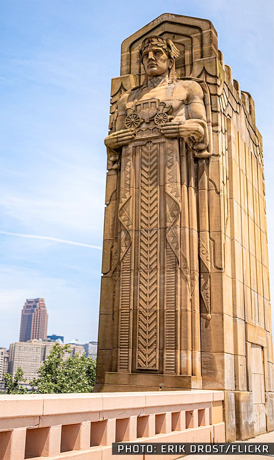
The new Guardians name is inspired by the towering 43-ft tall Guardians of Traffic statues which flank Cleveland’s Hope Memorial Bridge. The four winged-helmet statues, built between 1927 and 1932 show the progression of various means of road transportation over the years, from covered wagons and stage coaches up through passenger automobiles and construction trucks.
“In searching for a new brand, we sought a name that strongly reflects the pride, resiliency, and loyalty of Clevelanders. ‘Guardians’ embodies those defining attributes, while drawing upon the iconic ‘Guardians of Traffic’, proudly standing just outside Progressive Field on the Hope Memorial Bridge,” said team owner Paul Dolan at a press conference today. “[Indians team] memories do not diminish with a new name. ‘Indians’ will always be part of our history, just as Cleveland has always been the most important part of our identity.”
LINK: The origins of “Chief Wahoo” and the Cleveland Indians name
The team surveyed over 40,000 fans, community leaders, and front office personnel during their several months of researching a new name. From those conversations the team came up with a list of nearly 1,200 potential names which they carefully trimmed down over time.

“Through all of our research three key themes emerged,” explained Brian Barren, the team’s executive VP of sales and marketing. “The first one was to connect to the city of Cleveland in a genuine and authentic way. Second, honour our rich Major League Baseball history here in Cleveland, and finally unite our community … We believe ‘Guardians’ reflects all three of these insights that were most important to our fans.”
“I wanted to make sure everybody understood that we are trying to be the most respectful we can,” said manager Terry Francona. “It’s not about us, it’s about other people, and you have to step outside of your own skin and think about other people that may have different colour skin and what they’re thinking. We’re trying to be extremely respectful and I’m really proud of our organization”
THE GUARDIANS LOGOS & UNIFORMS

The new Cleveland Guardians logos pay tribute to the history of the Cleveland Indians. The colours remain red, navy blue, and white; the scripted home and road jersey wordmark are both very similar to what the club has been using for several decades. The new font style is based off of what the team wore during past Championship seasons.
But let’s start with a look at (what we believe to be) the new primary logo.
The team has nicknamed it the “Guardian Fastball” logo while also calling it “one of the most important and unique elements in the design of our new brand”.
The design shows twin “G”s with wings wrapped around a baseball. The wings are a reference to the winged helmets worn by the Guardians of Traffic statues we mentioned earlier in this post. The “G” wrapped around the baseball is meant to show it is protecting it (as a guardian would) but is also designed to resemble the grip a pitcher would use for a split-finger fastball, “a tribute to our strong pitching heritage here in Cleveland,” explained Barren.
This logo will be worn as a sleeve patch on, at least, the home white and home alternate red jerseys.
The new cap logo, referred to as the “Diamond C”, also references the Guardian statues in its design.
“The new ‘Diamond C’ stands tall, just as the Guardians of Traffic stand tall watching over our ballpark,” Barren continnued. “It draws from the ascending diamond motifs at the top of each Guardian pylon and the tapered shape is also inspired by the letterforms from our 1920 and 1948 World Series clubs.”
The logo will be worn on the front of the Guardians’ home navy/red and road all-navy caps with a straight-up, simple-swap out with the Indians current “Block C” logo.
Finally, the jersey wordmarks.

The scripted style of the Indians home jersey wordmark, which has been in use since 1994 (but has also been used by previous Indians teams), still remains with the Guardians but (obviously) with the name changed. The style of the font has been adjusted, a more angular design that evokes memories of the 1970s style Indians jerseys, but also meant to mimick the trusses on the underside of the Hope Memorial Bridge. This scripted mark will be worn across the chest of the home white and home alternate red jerseys.
On the road the Guardians will wear their new “Bridge Print Font” featuring “CLEVELAND” arched in that same style as the “Diamond C”. This design will be worn across the chest of their road grey and road alternate navy blue jerseys.
CLEVELAND GUARDIANS UNIFORMS

The uniforms are a straight swap out of the old name/logos for the new. Same colours, same jersey design, same everything. The only addition is the new Guardian Fastball logo which looks to be a patch on the home white and home red alternate jerseys only in these mockups provided by the team.

As I mentioned earlier in this story, the Cleveland Indians name will remain throughout the remainder of the current 2021 season; as soon as the World Series is over the switch to Guardians will be put into effect. The club will take the field with the new name and uniforms for the first time during Spring Training next February.
Related stories:
 2022 MLB Little League Classic Logos and Uniforms: Orioles vs Red Sox
  MLB Unveils Gold and Grey 2022 All-Star Game Uniforms
  Surf’s Up! Los Angeles Angels Unveil City Connect Uniform
  Atlanta Braves to Wear 1974 Throwback Uniforms This Weekend
  Fountains of Reign: Kansas City Royals Unveil New City Connect Uniform
  In Bloom: Washington Nationals Unveil 2022 City Connect Uniform