An entirely new league with eight fresh football teams requires a certain sense of togetherness in order for success. As the Alliance of American Football aims for its inaugural year kickoff in February 2019, the logo set of all eight teams embraces that aligned approach.
The league put together a design team to form the logos for each team, designing all eight in concert for a uniform approach. “We are The ‘Alliance’ of American Football for a reason,” says Marc Jacobson, head of brand for the league. “We are an alliance between fans, players and the game of football. One of the design parameters in our creative brief was to make sure that we developed team identities that when put side-by-side would weave a consistent thread, yet allow for unique and distinct design differences within each logo. This approach ties into the larger mission of The Alliance.”
From Atlanta to San Diego, Arizona to Orlando, Birmingham to Salt Lake and Memphis to San Antonio, the eight marks have a distinctly aligned approach, each with a graphic icon atop a word mark, all set on a coloured background.
Getting all the marks to have a clear design that still fit as part of a family was the goal of Jacobson, who put together a “diverse group of artists” led by designer Joe Bosack.
“When you bring together a diverse team of designers you end up with a synergistic process that borrows on itself,” Bosack says. That alliance of design, he says, allowed the design team to focus individual team identities around three key elements: a primary icon, secondary ligature and a word mark.

“Three key identifiers that offer a high degree of flexibility across a broad range of potential applications,” he says. “Key thoughts were: simple, iconic, pro-style and practical in application.”
When it came time to form identities, The Alliance of American Football looked to the history, population and industry of each city. “These are all things that contribute to the authenticity of a city and all things that were considered in the design process,” Bosack says. “We wanted to create marks that were profoundly connected to the cities they represent, to align with the values of the people that live in these cities and to foster a sense of pride in each market.”
Using that research, the design team then worked on colour, which Bosack calls a “critical role in any branding project.” Without repeating colours across the eight teams, the group deliberately applied colours inspired by each of the team’s geography and name. As with any professional sports team, the application on the field and in retail played a key part in selecting the final hues.
For the Atlanta Legends, which ties to Martin Luther King Jr., Hank Aaron and the city’s history of hosting the Olympics, purple plays a profound role in the design.
The Arizona Hotshots pays homage to the elite team of wildland firefighters. Jacobson appreciates the way the multiple design elements used in the primary icon “tie so cleanly together.”
The iron industry, once a key part of Birmingham, represents “strength, endurance and unwavering power” in the strong black and silver industrial look of the Birmingham Iron design. The “I” in the Birmingham Iron ligature logo comes as a play off of a steel I-beam for added impact.
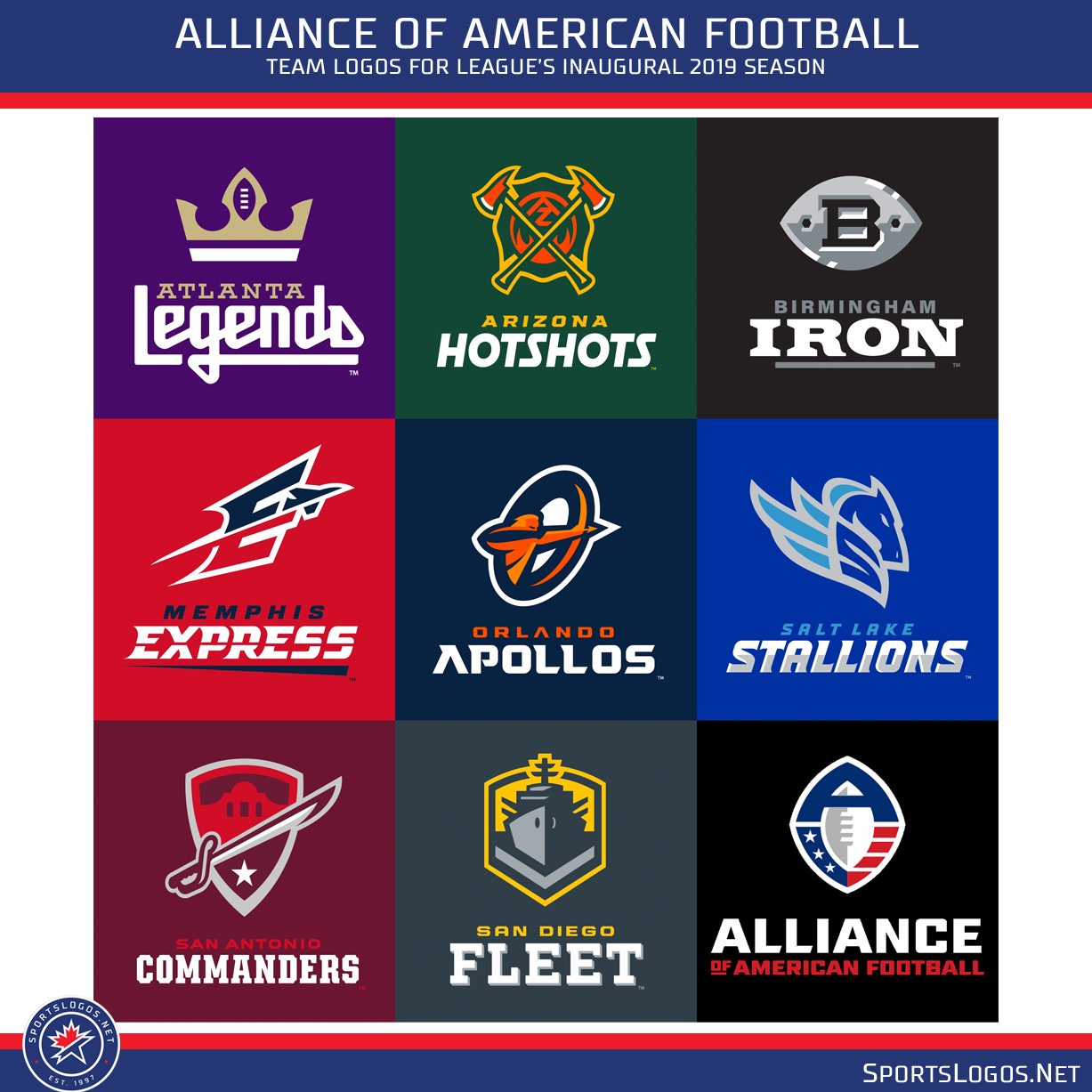
Whether an unofficial nod to the home of Federal Express or simply a take on a city that moves quickly, the Memphis Express shows plenty of motion throughout its red and blue design. Designers used a “speed line” running through the Express wordmark, “tying it into the overall theme of speed in the team identity,” Jacobson says.
With ties to both the sun in Florida and the fact that the Apollo space missions originated nearby, the Orlando Apollos have plenty of meaning in their name, which also brings in the orange of the sun into the colorway. Jacobson especially appreciates the way the archer in the Apollos logo fits into the stylized “O.”
The Salt Lake Stallions put a focus on the untamed lands from the mountains to the shores of the Great Salt Lake with a design that embraces all things blue while the military history of San Antonio can’t be overlooked. Dubbed Military City, USA, the San Antonio Commanders embraces both the past history of The Alamo (the building plays a subdued role in the mark) and the current history.
The military history of San Diego also comes into stark view. With such a powerful U.S. Navy and U.S. Marine tradition in San Diego, both past and present, the San Diego Fleet embraces those ties with its pronounced vessel logo in a ship-friendly grey. The shape of the primary icon and use of the single chevron in that logo pays respect to the Navy base in San Diego, Jacobson says.
As these eight new teams turn to the field, the visual identity of the Alliance of American football really offers us an alliance of design.
Studio Stories is a monthly column from Tim Newcomb that explores the stories behind some of the designs dominating the sports landscape. Follow Tim on Twitter at @tdnewcomb