In today’s edition of looking at what’s new with Major League Soccer kits for 2018, it’s time to take a trip to the soccer hotbed of the Pacific Northwest, where we’ll be looking at new kits for each of the three Cascadia clubs.
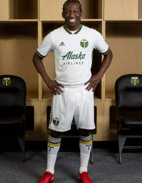
For starters, we’ll be going back a bit to take a look at the latest clash kit for the Portland Timbers.
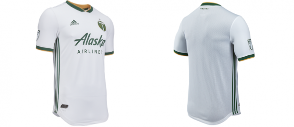
As you can see, it’s very simple and straightforward. The biggest talking point is the fact that the Timbers actually went with a white kit for their clash kit instead of going with a “Rose City” red alternate look that we’ve gotten used to. With that being said, this white kit definitely pairs very nicely with the home kit and as such, the Timbers definitely have one of the best looks in the league as we head into 2018.
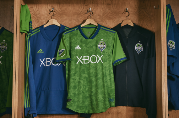
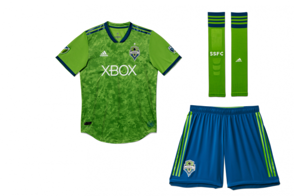
Now it’s time to take a look at what Portland’s arch-rivals have in store for this season, as the Seattle Sounders were due for a new home look for 2018. The blue sleeves from their 2016-17 home kit are gone, as the team has gone back to its normal look of all-rave green on the body and sleeves of the shirt. They’ve got what they’re calling a “brush-stroke print” design on the body of the shirt and that’s as far as things go when it comes to any particular design elements. The rest of the kit is very straight forward and it’s not a bad thing at all.
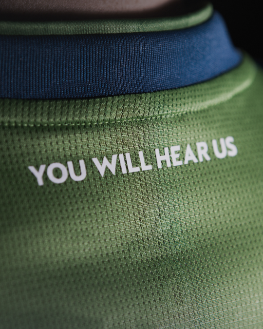
The most interesting part of this is the fact that the phrase “You Will Hear Us” is actually the motto of SB Nation’s Sounder At Heart blog. I’m sure that the community for that website is thrilled to have that on there and I’d also imagine that people who blog about sports on the internet now have a new gold standard when it comes to the team you write about actually recognizing what you do.
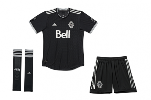
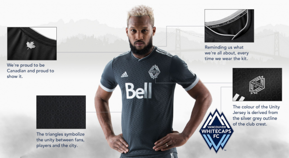
Finally, our trip through Cascadia takes us up to British Columbia, where the Vancouver Whitecaps will have a new clash kit as well. The Whitecaps normally stick with a navy blue clash kit, but they’ve decided to go in a different direction/ It’s still a dark look, but now they’re going with a black and silver look.
The Whitecaps normally do a good job of releasing infographics whenever they release a new shirt and this is no different. Big thanks to the Whitecaps for continuing to be cool in that regard.
I don’t think that the fans of any of these three clubs should have much to complain about when it comes to these kits and it continues a pretty nice streak of kit unveilings that Adidas has been on so far during this offseason. Do you all agree?
Related stories:
 MLS Renews Calls to End Plastic Waste With Return of Parley Kits
  2023 Football Kit Preview: Major League Soccer
  Adidas, Major League Soccer Extend Contract Until 2030
  Busy Wednesday Sees 13 MLS Clubs Launch New Jerseys for 2023 Season
  Photos of Leaked New Kits for 4 MLS Clubs Pop Up Online
  2022 Football Kit Preview: Major League Soccer
  As 2022 Season Kickoff Approaches, 7 MLS Teams Unveil New Kits on Tuesday
  MLS 2021: What’s New in Kits and Logos