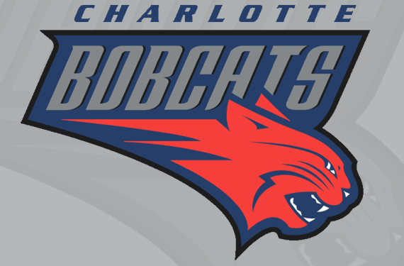
This week we bid a fond adieu to the Charlotte Bobcats, a team that was named after its owner, that never won a playoff game in its decade of existence, and that really liked tweaking its logo.
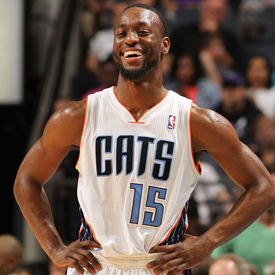
![]() In their final game as the Bobcats on Monday, Charlotte was unceremoniously swept from the playoffs by the Miami Heat. Next season they’ll relaunch as the Hornets (that’s their new logo at right), reprising the name of the city’s previous franchise, which moved to New Orleans in a flurry of ill will prior to the 2002 season.
In their final game as the Bobcats on Monday, Charlotte was unceremoniously swept from the playoffs by the Miami Heat. Next season they’ll relaunch as the Hornets (that’s their new logo at right), reprising the name of the city’s previous franchise, which moved to New Orleans in a flurry of ill will prior to the 2002 season.
When Charlotte was awarded an expansion franchise to replace the original Charlotte Hornets, the team turned to the firm Gameplan Creative to come up with a logo and branding. Focus groups and internal discussions turned up one obvious and exciting team name, according to Tom O’Grady, Gameplan Creative’s president and CEO.

That name was the Charlotte Flight. The name is great for a basketball team, and has obvious connections to North Carolina’s claim to playing host to the first manned flight. Heck, even the state’s license plates, which read, “North Carolina: First in Flight,” would have served as free advertising for the team. The logo sketches above are from a publication produced by Gameplan Creative called Creating a Brand Identity: How Charlotte Became the Bobcats.

Another team name with enough potential to make it to the sketch phase was the Charlotte Dragons, but it was not meant to be.
“Bobcats was sort of handed to us by Bob Johnson because of his first name. We bantered about it and we said, ‘Hey, you know, Flight tested better…’ and he’d go, ‘I’ve got 300 million reasons why I think it should be Bobcats,’ and that kind of was it.” – O’Grady on original Bobcats owner Robert Johnson
“We all kind of liked Flight ourselves because it had a lot of different things we could have done with it,” O’Grady continued. “Bobcats is more like a high school name of a team.”

That said, when the Bobcats were introduced, at least people didn’t hate it.
“It wasn’t flamed,” said O’Grady, who worked for the NBA as the league’s director of the league’s creative services division in the 1990s and early 2000s. “There wasn’t too much rebellion against it, and Charlotte was kind of glad to have an NBA team back. It wasn’t like anything out of the dock where the thing was already sinking.”
The new franchise seized on that new-franchise glow, but needed to have moderate success on the court to build a brand. Instead, they were consistently one of the worst teams in the league. They made the playoffs only twice in 10 years (getting swept both times), had a thing called “The Gerald Wallace Era,” and set a record for the worst-ever NBA winning percentage during a 7-59 campaign in the lockout-shortened 2011-12 season.
According to O’Grady, the team’s branding didn’t fare much better.

“I just think they botched it,” said O’Grady, who was not involved with design decisions regarding the logo after handing it over to the team. “They kind of stunted its growth before it got a chance to ever blossom. They started chopping it up and changing its colours. I think they’ve had four uniform changes in a little bit over 11 years. They had no brand continuity there whatsoever.”
He continued, “If you took the McDonald’s arch the first 11 years and you made them purple and changed it to sideways and then cut off one of the arches, you’d never know what you had.”

The original reddish orange was selected in part because it was unique to NBA teams at the time. It conveys energy and motion to match the speedy bobcat image. But then-owner Robert Johnson had his hands in that pot, too, according to O’Grady. “Bob had an affinity for not only his name, but had gone to the University of Illinois in college,” he said. “I think he did his post-grad work at Princeton, so he had a proclivity to orange as well. So the boss was driving the boat there, pretty much.”
Seth Bennett, the team’s Senior Vice President of Marketing, Entertainment, & Interactive Media since 2006 (two years after the team’s debut), said that the colour changes and logo tweaks throughout the years were borne of solid research. “The orange was a very popular and dominant colour in the Bobcat colour palette initially, and it was very trendy at that particular time,” he said.
 But trends started to change and there was another colour that nearby Duke and North Carolina universities had already rendered popular in the area. The first colour change came in 2007, beginning a gradual shift away from the orange as the dominant colour.
“The task was to set out to create a blue,” Bennett said. “That would hopefully be a colour, from an apparel standpoint and a team image and branding standpoint, that fans would feel a little bit more connected to, versus a trendy fashion colour that the orange represented.” (The alternate logo here from 2007 reflects a C for Charlotte, and a crown signifying the city’s nickname, “The Queen City.”)
When Michael Jordan became the majority owner in 2010, the team did a comprehensive market study involving ticket holders, other fans, and the community at large, which led to further changes in 2012. “Michael wanted the opportunity to listen to the fans and see how he could interject some new thought and direction,” Bennett said. “With that said, orange became more of an accent colour and we went more toward the navy and the cool gray, and then another accent colour of the light blue.”
![]()
Another significant change in the brand was the introduction of a front-facing cat logo.
O’Grady says that Gameplan Creative initially steered clear of a front-facing cat to avoid looking too similar to other teams in the league, like the Timberwolves, Bulls, and Grizzlies. “The attempt was to do something that was a little more speed,” O’Grady said, “not just a cat glaring you down ready to snarf you down. It was meant to be something that had a little speed and motion because it is sports. We wanted to do something that was more of an icon than literally a drawing.”

But the team needed a logo that was more flexible—and easier to centre. The forward-facing cat, officially the team’s secondary logo, “gave us a little bit more of a balanced template to be able to create print and some of the digital pieces that we were getting into at that time,” Bennett said.
While the primary logo officially remained the cat in profile throughout the team’s existence, the secondary front-facing logo was well received by fans, so the team featured it prominently, from the arena’s centre court to the avatar on the team’s Twitter and Facebook pages. In spite of strict NBA regulations about primary logo use, Bennett said, “We have the ability to use our secondary logo as prominently as we choose to. So that’s more of a conscious decision and, really, I think our fans took to the forward-facing cat.”
Asked whether the team worried about the number of changes to their identity over the years, Bennett said, “You could probably put a dozen of us in a room and you might get a dozen different opinions, or it may be split 50/50.” But if the opportunity had not come along to reprise the name Hornets, Bennett was confident that the team was done with changes for a while. “What we did in 2012 probably was going to be sustainable for quite some time,” he said.
But the cold, hard fact remains that the success of the brand is tied to the success of the team. “Sometimes I read these articles and they’re like, ‘We want to refresh with a new logo,’” O’Grady said, “and I’m like, ‘Oh, c’mon for Christ’s sake!’ Have a plan for how your team is going to grow and how you’re going to build your franchise.” He continued, “You’re not losing games because you have an orange logo. You’re losing games because you don’t know what you’re doing in the front office.”
While the team did not exactly thrive on the court historically, there was excitement around the team after marked improvements the last couple years, including a playoff appearance this season. “We had some of the best years ever these last two years, including this year, in terms of the sales of apparel and merchandise,” Bennett said.
While they might not agree on specific branding decisions regarding the Bobcats, O’Grady and Bennett agree that the return of the Charlotte Hornets is a good thing. The Hornets nickname derives from a letter a British Revolutionary War general wrote, describing the city’s relentless citizens and soldiers as “hornets nest of rebellion,” so you can see how the people of Charlotte felt protective of it.
“When [the Hornets name] was taken away people were like, ‘Wait a minute. Take your team, but how can you take something that was a part of our community and have it live somewhere else?’” – Seth Bennett, Bobcats Sr VP of Marketing
“I’m really happy for Charlotte because I think it should have always been the Hornets,” O’Grady said “They should have never left and it should have always been the Charlotte Hornets. They had a strong franchise and they had a nice new home. Life would have been awesome.”
Life may yet be awesome for basketball in Charlotte. But they’re going to have to win a playoff game first.
Related stories:
 Charlotte Hornets Unveil New Retro Uniform
  Hornets to Celebrate 30th Anniversary of First Season
  New Charlotte Hornets Logos Coming Next Weekend
  Colour Scheme for Re-Born Charlotte Hornets Announced
  NBA on the Path to Renaming Bobcats the Hornets