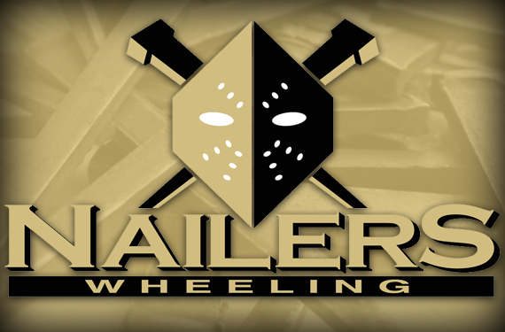
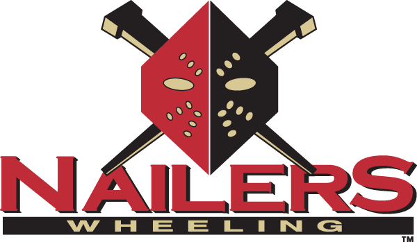
Even before you know the story behind it, the logo for the Wheeling Nailers, ECHL affiliate of the nearby Pittsburgh Penguins, works. It’s intimidating in a kick-ass, horror movie sort of way, and it’s certainly one of the more menacing logos in minor league sports. But there’s much more to this identity than the cool factor—it has a specific and significant connection to its hometown, where it is embraced by local fans.
In the late 1800s, Wheeling, West Virginia, had the largest cut nail plant in the world, which earned it the nickname “Nail City.” While the booming steel industry has since declined, its influence on the blue collar culture that exists in West Virginia can still very much be felt there today. The Wheeling Nailers make sure that Wheeling continues to be Nail City, paying homage to their home city’s heritage with their logo and nickname.

“Wheeling was a big steel town,” said Craig Bommer, the team’s Vice President of Business Operations. “Nailers came from the cut nail plant that’s located a couple blocks down south of the arena.”
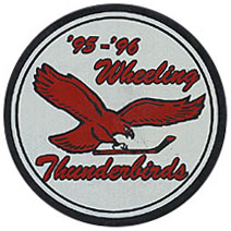 Before they were the Nailers, the ECHL hockey team in Wheeling from 1992 to 1996 was called the Thunderbirds, which was changed out of legal necessity. “They were using the Philadelphia Eagles eagle as the Thunderbird,” Bommer said, “and obviously the name of the team out in Seattle [the Western Hockey League’s Seattle Thunderbirds] was trademarked.”
When it came time to rename the team, a contest turned up two finalists, Nailers and Goalminers (a play on words related to coal mining, another big industry in Wheeling). The name-the-team contest, normally a milquetoast affair, became a source of pride for locals representing both industries.
“What put Nailers over the top was that Wheeling-Pittsburgh Steel had a ton of employees and they all voted for it,” Bommer said, referring to the famous steel manufacturer headquartered in Wheeling from 1986 to 2013.

And just what is a cut nail? According to noted handyman Bob Vila, “Cut nails provide the look of early American construction to wood floors, doors, cabinetry, or fencing.” He continues, “Cut nails are sheared by machine from steel plate, producing a nail with a distinctive wedge shape that ends in a blunt point.”
So when it comes to place-specific names, Nailers hits its mark, and it helps sell the team to fans. “It’s a nickname that actually applies to the city,” Bommer said. “A lot of teams will just do a nickname because it sounds cool and it really has nothing to do with the area. Nailers definitely does with it being a steel town, so I think that helps it a lot with the people getting behind it.”
The logo and the name have broad appeal, some of which is by design and some of which is because the team is lucky to play in a city with a kind of cool name. “In hockey you would say they were ‘wheeling’ when they were going fast,” Bommer said. “And the name Nailers has so many meanings outside of a cut nail plant—when it comes to hockey, ‘I nailed him.’ Both names have kind of a hockey terminology to them as well, even though they weren’t meant that way.”

The logo itself looks like a Jason-style hockey mask, but those who know the industry see something else. “It is similar to a hockey mask,” Bommer said, “but it’s actually the mask the guys would wear in the factory when they were actually cutting nails.”

 The team is located just down the road from its NHL affiliate in Pittsburgh, so they play up that connection in their visual identity. The Nailers adopted black and gold as their team colors to reflect the Penguins, dropping red from their logo before the 2012-13 season.
In addition to the team colors, their uniforms reflect that of their parent club as well. “Minor league jerseys always have that cool factor, so if people in Pittsburgh were wearing a jersey that looked like Penguins but had our logo, maybe it would add to merchandising,” Bommer said. “We’re 45 minutes from Pittsburgh. A lot of teams are a lot farther away. We just thought adapting to the Penguins, being that close, maybe we could attract some of the people down here.”

The most notable development regarding the Nailers’ future is a nod to its past. A previous alternate logo, retired in 2011, features what Bommer calls the working man. In the background is a gear unique to the cut nail plants in Wheeling. “Every time we saw a picture, there were these big gears in the background that they would run the steel through,” Bommer said. “We were like, we have to use that.”
The logo was popular, as it portrayed the local community, so fans will be glad to know—and this has not been revealed to the public until right now—that the working man is part of the team’s future. “The working man is definitely going to be coming back. We’re actually working on it now, getting some drawings,” Bommer said. “More of a 3D look, so as soon as we decide on one, we’re hoping to bring him back in the next year or so.”
The Nailers’ most popular current alternate logo features the cut nails without the mask, which they debuted on a warmup jersey this season. It’s been well-received enough that it may warrant more expanded use in the team’s future. “The fans love it,” Bommer said. “I imagine that will go further next year.”

Another alternate features a circle with the team name around the mask, which is currently used only on merchandise, though Nailers fans may see more of this one in the future as well. “It doesn’t appear on the jersey yet,” Bommer said. “It will in the next couple years, but right now it doesn’t.”
While the team is expanding its collection of alternate logos, they will remain true to the identity that fans have embraced. “The mask and the nails, they’re permanent,” Bommer said. “We can put other things out there, but in the end it’s still going to be the mask and the nails.”
The Nailers’ identity works because it is intimidating and sleek—something you want on a hockey team—but more importantly, it reflects a specific and unique story related to the team’s hometown.
Related stories:
 ECHL Gladiators Pay Tribute to Atlanta Hockey History With New Uniform
  G Love: The Story Behind the Gwinnett Gladiators
  Happy Friday the 13th, It’s Jason’s Favourite Hockey Logos!
  Skating in the Swamp: The Story Behind the Florida Everblades
  Right as Reign: The Story Behind the Ontario Reign
  Utah Grizzlies Skeleton Uniform Headed to HHOF
  Hockey’s Scariest Scavengers: The Story Behind the Bakersfield Condors