Eleven years ago today, the Dallas Stars unveiled their current logo and uniform, marking the most significant shift in the franchise’s visual identity in over two decades.
The Dallas Stars revealed their new logo and uniforms at a press event in Dallas on June 4, 2013, just two weeks after everything leaked via the club’s iPhone app. I had been invited to cover the event, which would have been my first time at a “Big Four” league team’s logo unveil, but I opted not to attend as my first child had just been born a few days earlier. Priorities!
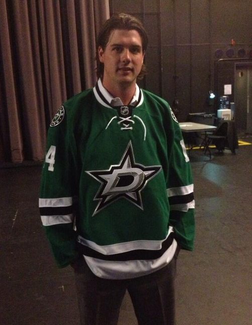
It was the first drastic change in the Stars’ primary logo since 1991 when they were in Minnesota. The new logo gave the team its first truly “Made in Dallas” primary logo. It featured a “Big D,” a common nickname for the city of Dallas, on a two-toned silver star with bevels outlined in black and green. The design eliminated gold from the colour scheme, which had been part of the franchise’s identity since its inception as the Minnesota North Stars in 1967.
“I’m excited. My hope is that the logo will be one that they’ll love. It’s void of any word mark, but I think any fan will look at it and see a D and a Star. There’s only one Big D, so the logo will be easily recognizable. I love its simplicity,” said Stars owner Tom Gaglardi at the unveiling.
The rationale behind replacing gold with silver was twofold. The club found it challenging to maintain a consistent shade of gold across different mediums, and they noted that stars appear silvery in the night sky, not gold.
The uniforms, too, embraced this new look. Green, specifically “Victory Green”—a unique shade to the NHL described as a mix between Kelly Green and Forest Green—became the primary colour for the home jersey, replacing black. “Instead of Kelly Green having that one shade yellow too much, we needed one more shade of blue in there to bring it back. And when we did a television test, it looked unbelievable on TV. It really popped,” explained Jason Walsh, Dallas Stars VP of Production and Entertainment.
The journey to the final design was a collaborative effort involving various stakeholders, including the NHL, the Stars, and Reebok. “Changing the logo and jersey really began during my first conversation with [Stars owner] Tom Gaglardi… he never really appreciated the original Dallas Stars logo,” recalled Stars President Jim Lites. Gaglardi added, “I didn’t feel comfortable going forward, that our logo stood up next to the best ‘Original Six’ logos and the best logos in the NHL… and that was what we deserved.”
The Stars engaged with internal staff, broadcasters, and former players like Joe Nieuwendyk, setting up whiteboards to sketch ideas. During these sessions, the main concept of a “D” with a star emerged. Jeff Neal, the Stars’ animation coordinator, was tasked with developing preliminary designs. Various colour schemes were considered, including black, green, and gold; red, white, and blue to emulate the Texas state flag; and even blue and gold similar to the St. Louis Blues.


Initial reactions to the new look were mixed, but the design’s simplicity and modern appeal gradually won over fans. In my article from the unveiling day, I noted that the new uniforms aimed to “pop” on television, contrasting previous years’ black-dominated, darker designs.
As Walsh said, “I hope they look at it and say it’s the Dallas Stars. This is who we are. It’s a D and a Star. We’re the Dallas Stars, in Big D. We just wanted it to be simple and classic with a modern look to it.”
Vibes are __________ pic.twitter.com/9pYnIAasws
— Dallas Stars (@DallasStars) May 30, 2024
Over the years, the logo and uniforms have become a beloved part of the Stars’ identity. The alternate logo, featuring the primary logo within a circle with the team name around it, found its place on the shoulders of the home and road uniforms. Another secondary logo showing the State map of Texas was eventually used as the main crest of their alternate black sweater.
In 2021, the Stars made a subtle update. The shade of green used in the logos was brightened to better match the fabric colour of the jerseys, addressing the difference in colour presentation between digital and textile mediums. “The colour change was made specifically for our digital assets to better match the fabric colour of the jerseys. We found that the previous version of our green appeared darker on digital assets. In contrast, our unique Victory Green on the jersey really pops and appears brighter. It’s a small change that most fans won’t notice. Still, we think it better captures the vibrancy of Victory Green,” explained Matt Bowman, Dallas Stars Executive Vice President and Chief Revenue Officer, to SportsLogos.Net.
Since the new look was released, the Stars have enjoyed success on the ice, including a run to the Stanley Cup Final in the 2019-20 season and several other trips to the Conference Finals. However, the club has never again won the ‘holy grail,’ as they did in 1998-99 while wearing the design this new look replaced.
Related stories:
 Over a Dozen NHL Teams Getting New Uniforms in 2017-18
  Dallas Stars Planning 1940s Texans Throwback?
  The 7 Best-Dressed Stanley Cup Finals of the Past 25 Years