Every designer has days when they’ve been daydreaming about making subtle changes to a years-old project long enough that they just snap and open up the old files and start working. They ignore the pop-up warning messages that the file was created in Adobe Creative Suite 3 eight years ago and that some functionality had changed and some embedded fonts are not available anymore.
It seems that the Wisconsin Timber Rattlers, Class A affiliate of the Milwaukee Brewers, had a day like that, and the result is today’s unveiling of an updated suite of logos. The new look features roughly the same color palette and a one-for-one exchange of old marks for new ones.
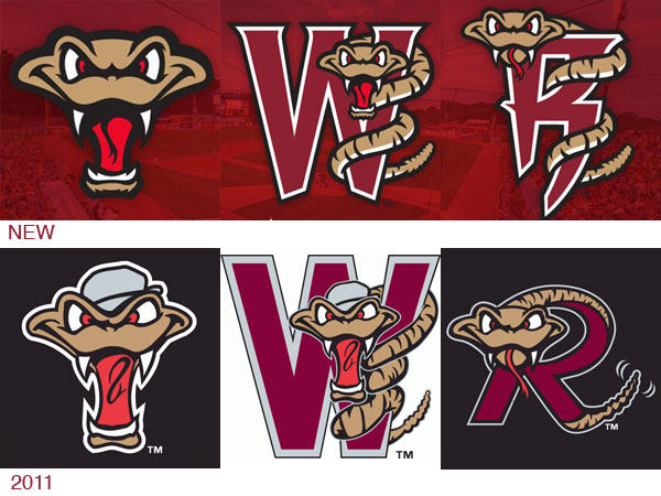
Most notably, the snake’s face has been revised to seem (to my eye, anyway) more menacing and less goofy. The previous identity’s blocky, sans serif typeface has been updated with a subtly serifed font. The team announced the changes in a video on social media this morning.
Out with the OLD… In with the NEW!
✔️ NEW Home Cap
✔️ NEW Away Cap
✔️ NEW BP Cap
✔️ NEW Alternate Cap
✔️ And Much MORE!🆕 https://t.co/Y24w7Y4YVW #TRatNation pic.twitter.com/fZNeo0bVix
— Wisconsin Timber Rattlers (@TimberRattlers) November 8, 2018
We’ll see the new look on the field when the Midwest League’s season begins April 4.