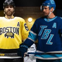
Yesterday’s unveiling of the Boston Bruins and Tampa Bay Lightning uniforms for the 2026 NHL Stadium Series immediately sparked a wide range of reactions across social media, with both designs drawing praise, criticism, and everything in between.
While they were officially revealed last night, seven weeks ahead of the February 1 outdoor game at Raymond James Stadium in Tampa, a leaked photo of the Lightning uniforms quickly circulated in the early afternoon, prompting some premature responses that many eventually clawed back.
SHOP: 2026 NHL Stadium Series jerseys for Bruins, Lightning available now!
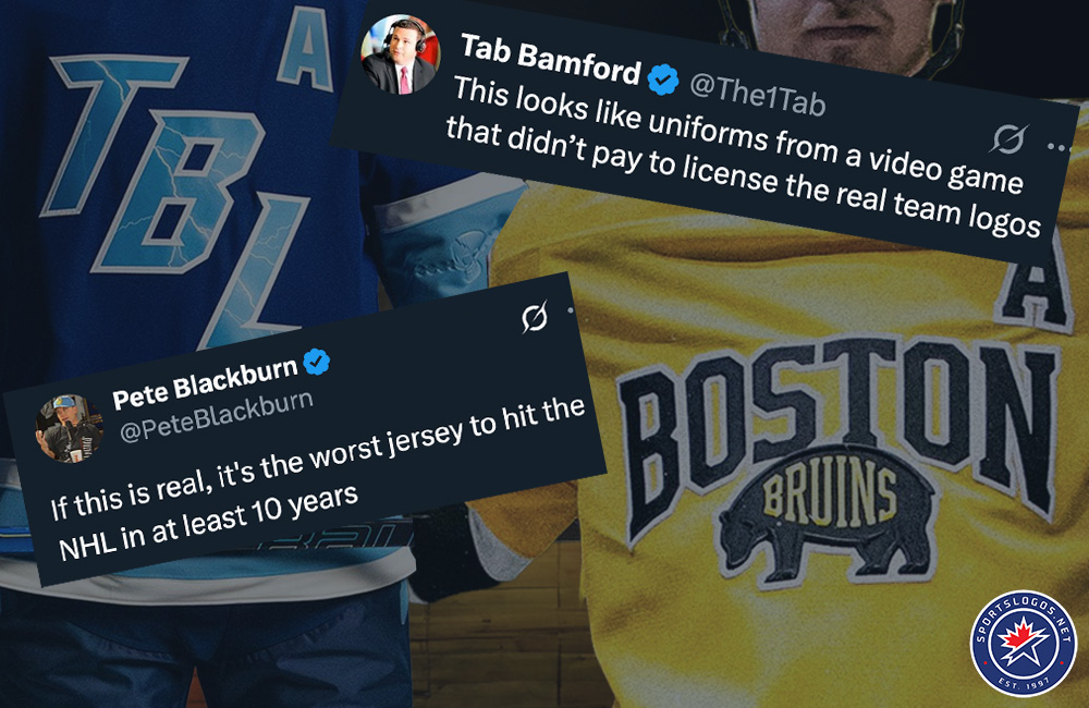
Much of that early backlash focused on the Lightning jersey, particularly its diagonal “TBL” wordmark across the chest.
Pete Blackburn of the What Chaos! Show reacted bluntly to the leaked image, writing, “If this is real, it’s the worst jersey to hit the NHL in at least 10 years.” Drew Livingstone of SDPN Sports followed with similar frustration, calling the design “lazy and ugly,” adding that diagonal lettering continues to feel overused. Bleacher Nation columnist Tab Bamford likened the jersey to “uniforms from a video game that didn’t pay to license the real team logos.” User @Kreider4Hart acknowledged being in the minority but added, “Everyone hates them, but honestly, I think they’re sweet.”
Other Lightning-focused reactions were critical but more specific. Lightning fan @wherescourtney, responding to early images of the Tampa Bay uniform, pushed back against the most extreme criticism, writing, “Yes, it’s bland, but it’s certainly not the worst of all.” Shayna Goldman of The Athletic acknowledged elements she liked, including the lightning pattern within the lettering and the two-tone blue colour scheme, while questioning whether the simplified “TBL” crest was strong enough for a Stadium Series game, noting that the shoulder patch appeared more visually compelling.
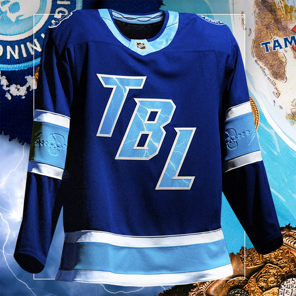
At the centre of Tampa Bay’s Stadium Series uniform is a new “TBL” wordmark crest, rendered in a new-for-the-Lightning sky blue with white trim and pierced by lightning bolts that extend through both the lettering and the back numbers. The mark replaces the club’s traditional lightning bolt logo and uses the same font first seen on the Lightning 2022 Stadium Series uniform in Nashville. On the shoulders, Tampa Bay introduces an all-new circular patch featuring the team name surrounding a skull-and-crossed-swords motif, a direct reference to the city’s Gasparilla pirate tradition. That pirate theme is carried throughout the uniform, including debossed sleeve details inspired by Gasparilla beads, bead accents inside the collar, and a tattered lightning-bolt pirate flag sewn onto the hem loop.
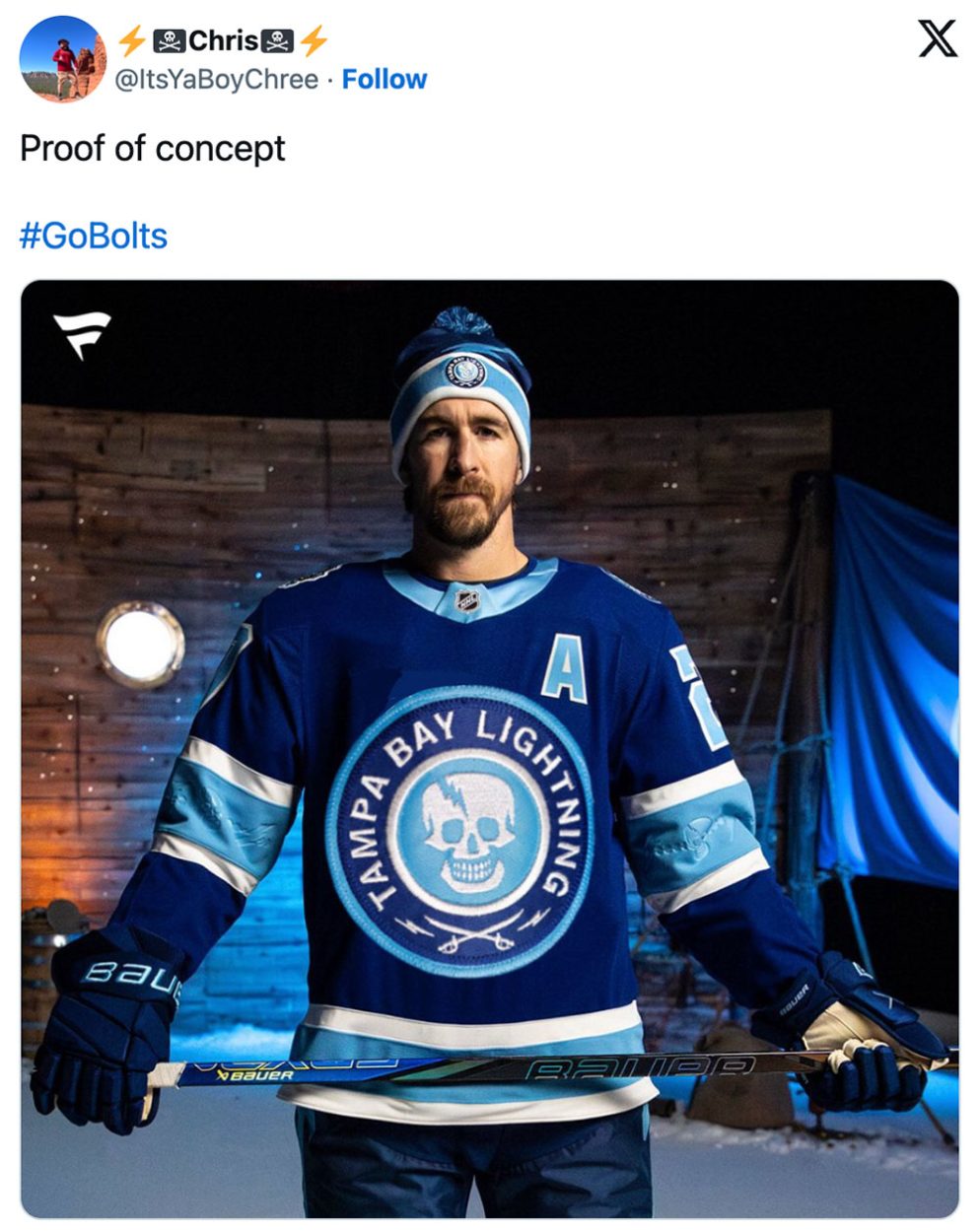
That pirate-inspired shoulder patch quickly became one of the most discussed elements of the Lightning design. Several fans suggested it might have worked better as the primary crest, including @ItsYaBoyChree, who wrote, “Kinda wish this was the logo on the front.”
Once the uniforms were officially unveiled, providing additional detail shots and context, many Lightning reactions softened. Blackburn followed up with, “These aren’t nearly as bad as the leaks made them out to be, but ‘TBL’ is so stupid.” Twitter user @TBFan613 initially reacted with confusion but later reversed course after seeing close-ups of the crest, numbers, and sleeve embossing, posting, “I TAKE BACK EVERYTHING BAD I SAID ABOUT YOU.” LightningInsider.com’s Erik Erlendsson admitted he expected not to like the jersey but came away appreciating the colour scheme and pirate-themed sleeve details.
Meanwhile, reaction to the Boston Bruins’ uniform followed a different path, without any really clear leaked photos spoiling the surprise; opinions had to wait until the whole design was fully revealed.
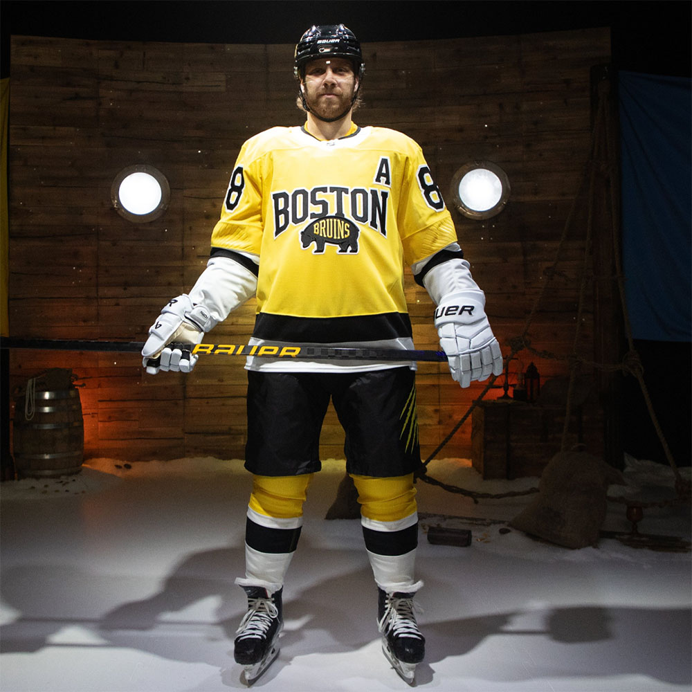
Boston’s Stadium Series uniform leaned into the setting of an outdoor game in Florida while keeping the Bruins’ traditional edge intact. The jersey introduces a brighter yellow shade, dubbed “Sunshine Gold,” paired with black and white striping around the waist and a white collar. “BOSTON” appears across the chest in black letters with white trim, with the familiar black bear logo placed beneath it. A new black “B” shoulder mark sits atop white bear claw slashes, a motif that also appears on the helmet and pants, while subtle sun-ray embroidery is worked into the sleeves. The look is finished with black numbers trimmed in white, a black helmet with gold claw marks and player numbers, yellow socks with black and white striping, white gloves, and inside-collar details listing the six New England states, with a sunset-themed Bruins logo appearing on the hem loop.
While still debated, much of the discussion centred on that brighter “Sunshine Gold” base colour, the white gloves, and the overall presentation rather than core design choices. Former Bruins goaltender Andrew Raycroft reacted positively, asking if this was the “Best Stadium Series jersey ever??” with several fans echoing that enthusiasm. User @dnk900 called the Bruins’ jersey “really beautiful,” while @Sundaytosunrise wrote, “The colour really shines, my son is going to love these.”
Others took a more measured view. Kevin Maggiore of 98.5 The Sports Hub wrote, “Are they my favourite? No. Are they still great? Yes.” Some fans questioned details like the white gloves, such as @Ghost882, who suggested the gloves could have been black to tie the look better together. Criticism of Boston’s design generally remained more restrained compared to the early response to Tampa Bay’s jersey.
Personally, both designs feel a little underwhelming given what the Stadium Series format allows. The event is typically positioned as a chance to push uniform design further than usual, and these results are comparatively restrained for identities built around lightning and bears. On the Lightning side, the pirate-themed shoulder patch stands out as the most compelling element and may have been better served as the primary crest, with the “TBL” wordmark shifted to a secondary position, such as the shoulder or pants. I’m also a fan of incorporating the lightning bolts into the numbers. Boston’s brighter gold works well in the Florida setting, but the oversized “BOSTON” wordmark layered above the bear logo feels unnecessary, and white gloves really aren’t my cup of tea. While I didn’t see this discussed much, the broad white striping at the waist and sleeves also stood out negatively to me.
The Bruins and Lightning will wear these uniforms when they meet in the 2026 NHL Stadium Series on Sunday, February 1, at Raymond James Stadium in Tampa, marking the second of two outdoor NHL games played in Florida during the 2025–26 season. For a full breakdown of both uniforms, including detailed photos, design elements, and official quotes, see our story from yesterday’s unveiling here. The Bruins and Lightning 2026 Stadium Series jerseys and related merchandise are available for pre-order now. They are on sale now through NHLShop.com
Related stories:
 Bolts, Bruins Reveal Uniforms for 2026 Stadium Series Game in Tampa
 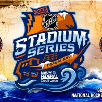 Avast, Me Hearties! NHL Unveils Swashbuckling Stadium Series Logo for Lightning vs. Bruins
  Boston Bruins Unveil New Uniforms for 2025–26, Throwing Back to the 80s and 90s
  Utah Hockey Club’s New Uniforms Won’t “Deviate Too Far” From Current Set