After absorbing a week of backlash from fans, the management of Columbus’s Major League Soccer team has reversed course, and will reinstate “Crew” in the club’s official name. A new crest has also been unveiled.
The announcement came on Monday, May 17, following a meeting between team brass and the Nordecke, a coalition of the club’s supporter groups. Both sides released a joint statement via Twitter:
The new crest includes the “Crew” name, as well as the number 96 — representing the year the club joined MLS as a founding member — inside an outline of the Ohio state flag, in something of a compromise between the new and old branding. It was unveiled on Twitter Tuesday afternoon.
The club had announced on Monday, May 10, that they were dropping “Crew” from the official team name, intending to go by “Columbus SC” going forward, but still encouraging fans to informally call the team “the Crew.”
That was met with immediate disdain, both inside and outside Columbus. The Nordecke said it only learned of the change three days before it was announced, and released a statement the day before saying it was “deeply saddened” by the development.
According to the Nordecke’s Twitter account, leaders of the group met with team officials on Monday afternoon. The change was announced soon thereafter.
This isn’t the first time an American soccer team has reneged on a name or crest change based on negative feedback. Here are some other examples:
Louisville City
In December 2019, Louisville City of the USL Championship unveiled a new crest that only referred to the club as “LouCity.” The club said at the time that the official name would still be “Louisville City Football Club,” but it intended to adopt “LouCity” as its primary name reference.

The backlash was swift, and within three days, the club president had issued a statement saying that the new brand rollout had failed. “We had the best intentions, but we lost sight of our responsibility to engage you in the process,” the statement read. “We make no excuses; we simply commit to making it right.”
In December 2020, the club unveiled a new crest that included the full “Louisville City” name.
Houston Dynamo
In December 2005, Houston got a Major League Soccer franchise after the former San Jose Earthquakes relocated (the league retained the Quakes’ name, colors and record for an expansion franchise that began play in 2008). A month later, after surveying fans online, the owners announced that the team’s new name would be Houston 1836.

The name was meant to reference the year the city of Houston was founded by Augustus Chapman Allen and John Kirby Allen. However, 1836 was also the year of the Texas Revolution, whereby the Republic of Texas broke away from Mexico. (Texas would eventually be annexed by the United States in 1846.) Approximately 1,700 people were killed during the war.
The inclusion of “1836” was protested by Hispanic supporters, and in February 2006, the club announced it would not go ahead with the name as planned. While options like “Lonestar,” “Apollos” and “Mustangs” were considered, ownership eventually landed on Houston Dynamo in March 2006, a reference to the energy-based economy in the area and to former USL club the Houston Dynamos.
Chicago Fire
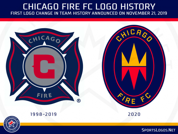
Since the club was founded in 1998, the Chicago Fire had used a Florian cross as the basis for their crest. It has, after all, been a symbol of firefighting since 250 A.D.
In November 2019, though, ownership decided it was time for a change. A new crest dubbed the “Fire Crown” was unveiled: “A simple icon that contains the fire itself, and a crown for the triumph over adversity of a people undefeated,” according to the club’s website.

The new crest was roundly ridiculed by supporters and pundits alike; even other MLS teams took potshots at it on social media. Owner Joe Mansueto told the Chicago Tribune in January 2020 that he had heard the concerns and “if it’s not working for people, we’ll fix it.”
Well, that’s exactly what’s happening. In January 2021, Mansueto announced that a new visual identity and crest would be in place in time for the 2022 season. Fans will have their say through roundtables, interviews, surveys, and input gathered through the club’s website.
Portland Timbers
In 2010, fans in Portland were eagerly anticipating the return of professional soccer after Merritt Paulson had acquired the USL’s Portland Timbers and secured a spot in Major League Soccer. But some were also dreading that the new logo devised by Paulson’s group would stray too far from the Timbers crest they knew and loved.
When the logo was revealed in June 2010, it was instantly met with derision. Fans at the unveiling event booed and chanted, “You f***ed up!” Paulson appeared to angrily confront some attendees who were laughing at the logo.

While Paulson was initially defiant, he and the Timbers ownership group eventually took the criticism to heart. Before the team kicked off the 2011 season, they rolled out a simplified version of the crest. Today, it’s even simpler, with the text removed.


