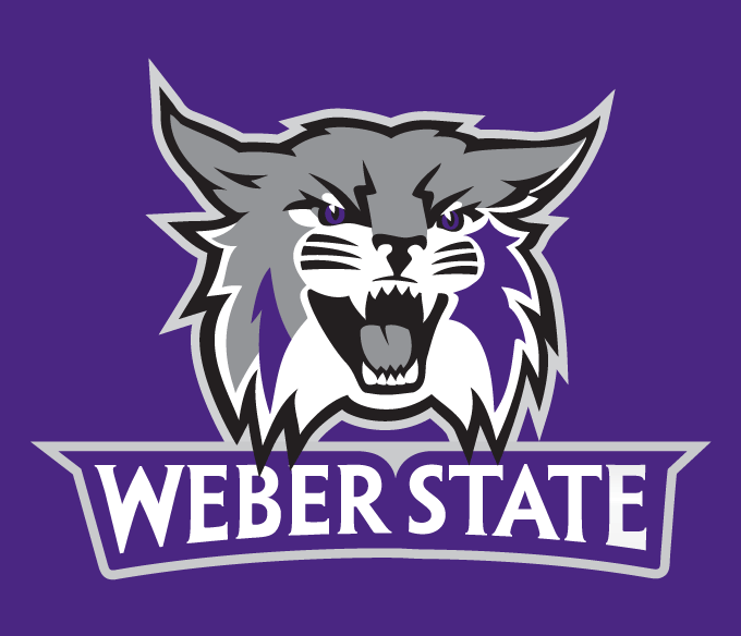
In our previous article researching the new Weber State logo, Assistant AD Ron Goch told us that Weber State’s Art Director Hillary Wallace was largely responsible for the designs, so we contacted her. Hillary provided us with the inside scoop of how the process went, how she was inspired, and even what methods she used. Our interview follows.
1. What direction did the university give, or was the process pretty well carte blanche? If they gave you guidance, how specific was it?
The need for a more comprehensive set of athletic marks is a conversation that has been floating around Weber State for years. Because of the time and resource commitment required for making such a change, it kept getting pushed to the back burner.
Several factors were the impetus for finally diving into the process. Weber State’s singular shield mark didn’t work in many applications, and that led to a proliferation of unofficial Wildcats and logo-type creations. Our new athletic marketing director, Ron Goch, who joined WSU in 2010, stressed that our brand suffered from the lack of consistency. Once again it was time to order uniforms for the coming year — something that was problematic without a good set of marks. And the straw that broke the camel’s back was the question of what logo to use on the football field’s new artificial turf.
2. In what medium did you begin the process? Pencil, Illustrator… clay?
Pencils, pens, napkins, envelope backs, notebooks and computers were all instrumental in the creation process. Once it was decided that we were going to update the marks, not redesign them, I found it easiest to work in Illustrator. All the existing shapes, pieces and parts I was charged with incorporating were already there.
3. Were there any alternative designs that were rejected? How many versions were there? Did it bounce around a lot?
Very early in the process there was a fair amount of exploration of very new ideas. I actually used sportslogos.net quite a bit to do research on the athletic logos of other colleges and share with our working group. Hundreds of ideas for font styles, cats and lettermarks were also presented to the group and key stakeholders. Ultimately, we decided to pursue an updated Wildcat and typography that could be used not only by athletics, but also by all club sports and non-academic units to promote school spirit.
4. What is your background? Have you designed for Athletics before?
I have been a graphic designer and art director at WSU for 11 years. I have designed for athletics, but this was my first athletics logo.
5. In looking at the spec sheet, we’ve noticed there one version of the cat head with black eyes and one with purple. Is this intentional? Does it have a purpose or use in mind?
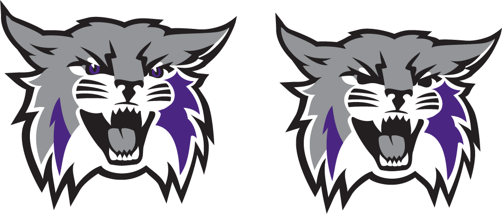
Very good catch! Yes. Everyone loved the Wildcat with the purple eyes, but in certain applications, like when the logo is embroidered on a shirt, that level of detail can’t be achieved. The same is true when the logo is printed in one or two colors, so we decided to simplify the cat for such applications, and keep the detailed version available for situations where the user has size and ink on their side, such as center court or online.
6. What point of the process did you become involved? Are you able to speak more towards the motivation behind the University deciding on a redesign?
Over a year ago, a small working group that included athletics leadership, a few WSU administrators and me began to explore the feasibility of rebranding and what it might look like. Some felt strongly that we needed to keep the unique shape of our Wildcat head, while others were interested in an “athletic W,” and still others saw value in an entirely new cat and wordmark. Everyone agreed that it was time to retire the shield. Yea! We agreed about something!
Through that process, we concluded that we would simply update and add to the current marks rather than start from scratch. Weber State typically uses a collaborative approach to problem solving, and this project was no exception. I like to say I can see everyone when I look into our Wildcat’s eyes.
7. AD Jerry Bovee has said many times that this is “just an update, not a redesign.” Do you agree with that assessment?
I absolutely agree with that assessment. While the idea of a redesign was intriguing, it wasn’t right for Weber State at this time. By simply updating, we could be more nimble throughout the overhaul process. We can also gradually incorporate the new logos as it is fiscally prudent. Our new Wildcat plays well with our old Wildcat, so they can both be in use at the same time without causing too much brand confusion.
8. Have you seen the logo in use anywhere yet? If so, what was that experience like?
I have seen prototypes for the new football helmets. They are going to be cool.
We appreciate the folks at Weber State taking the time to speak with us about their new identity. It was particularly interesting to hear about the process behind the new logos, and their desire to remain true to the existing Wildcat.
We wish Weber State good luck on the field of play, as we all can see they will look good doing it.
Stay tuned to SportsLogos.Net for future updates, perhaps even an early view of those helmets Hillary already saw.

